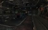
Beginnings of a small DM map, most likely 1 on 1...or at least 2-4 players.
It will be an indoor map just have not added the roof.
cooloola requested I create one... lets see how it goes")
It will be an indoor map just have not added the roof.
cooloola requested I create one... lets see how it goes
Attachments
Last edited: