Some people need to be pointed to this page :
http://www.joelonsoftware.com/uibook/fog0000000249.html
In fact I'd say that any interface-design that doesn't provide feedback about the effect of certain settings has already failed.
I don't care about whether or not I can enable AA x4 or FSAA or MSAA or how much the corona's are shown if I can't have immediate feedback on the results.
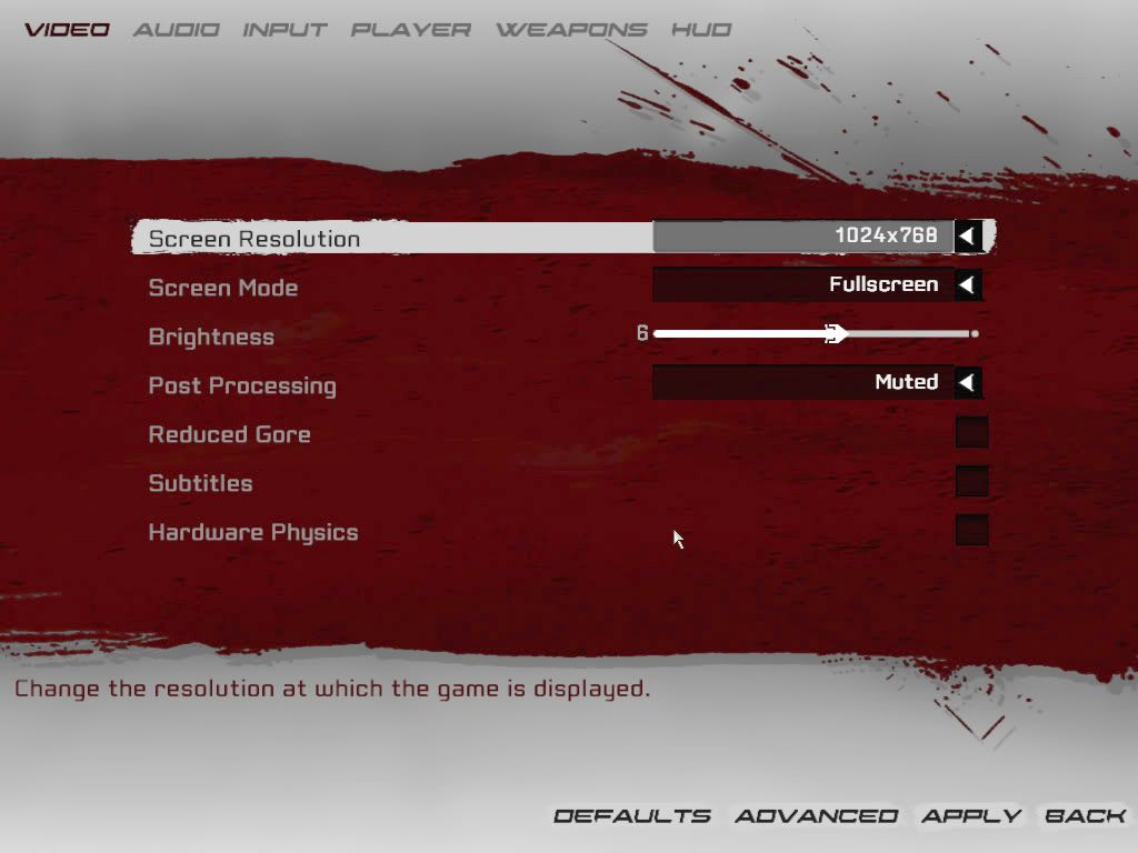
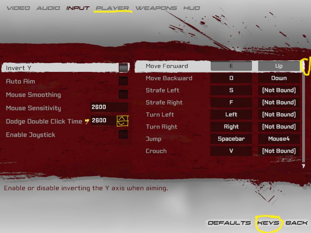
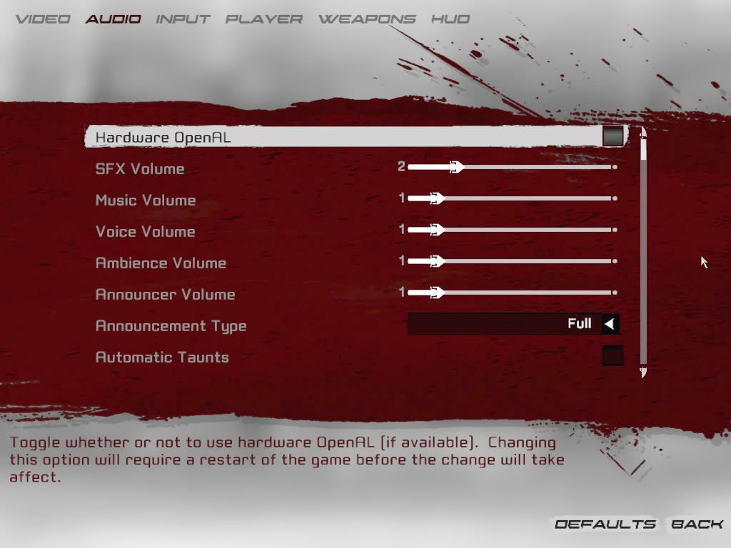
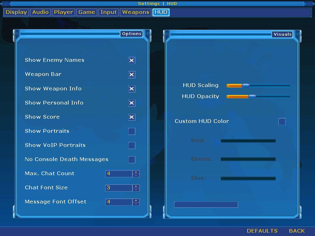
In fact I'd rather have a simple "world detail"-slider like UT3 has in favour of the dozens of incomprehensible switches that UT2kx itself had (and which most users didn't even know what effect they'd have).
I also seriously wonder if Epic's reasons for considering the UT3-GUI 'f*cked' are the same as yours.
I think he's looking at it from a design/developer point-of-view (ie : the code isn't consistent and has some 'odd' requirements) and less from a "must have a ton of options to set every option possible"-point of view that geeks tend to have.
To summarize : UT3's GUI may not be perfect but it's not as bad as UT2kx was.
http://www.joelonsoftware.com/uibook/fog0000000249.html
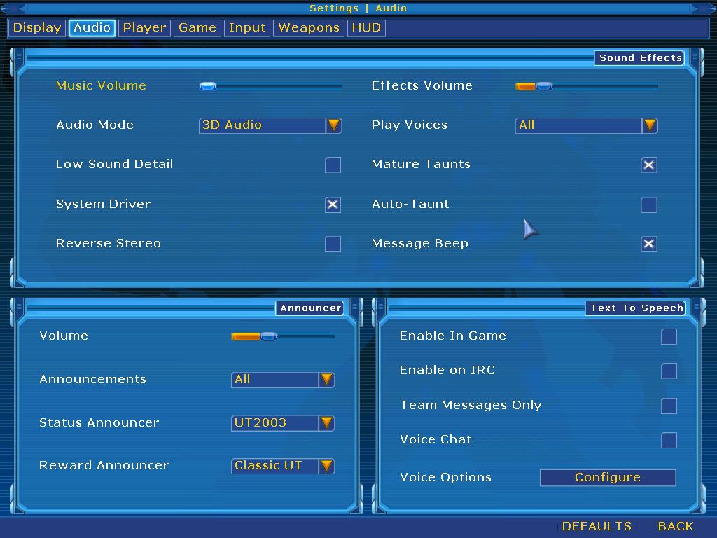
That best describes my opinion about the supposed 'need' for dozens of switches on the graphcs-page.Asking the user to make a decision isn't in itself a bad thing. Freedom of choice can be wonderful. People love to order espresso-based beverages at Starbucks because they get to make so many choices. Grande-half-caf-skim-mocha-Valencia-with-whip. Extra hot!
The problem comes when you ask them to make a choice that they don't care about.
In fact I'd say that any interface-design that doesn't provide feedback about the effect of certain settings has already failed.
I don't care about whether or not I can enable AA x4 or FSAA or MSAA or how much the corona's are shown if I can't have immediate feedback on the results.
In fact I'd rather have a simple "world detail"-slider like UT3 has in favour of the dozens of incomprehensible switches that UT2kx itself had (and which most users didn't even know what effect they'd have).
I also seriously wonder if Epic's reasons for considering the UT3-GUI 'f*cked' are the same as yours.
I think he's looking at it from a design/developer point-of-view (ie : the code isn't consistent and has some 'odd' requirements) and less from a "must have a ton of options to set every option possible"-point of view that geeks tend to have.
To summarize : UT3's GUI may not be perfect but it's not as bad as UT2kx was.

")