UT3 User Interface vs the rest

  • Two Factor Authentication is now available on BeyondUnreal Forums. To configure it, visit your Profile and look for the "Two Step Verification" option on the left side. We can send codes via email (may be slower) or you can set up any TOTP Authenticator app on your phone (Authy, Google Authenticator, etc) to deliver codes. It is highly recommended that you configure this to keep your account safe.

JaFO

bugs are features too ...
Nov 5, 2000
8,408
0
0
Some people need to be pointed to this page :
http://www.joelonsoftware.com/uibook/fog0000000249.html
Asking the user to make a decision isn't in itself a bad thing. Freedom of choice can be wonderful. People love to order espresso-based beverages at Starbucks because they get to make so many choices. Grande-half-caf-skim-mocha-Valencia-with-whip. Extra hot!

The problem comes when you ask them to make a choice that they don't care about.
That best describes my opinion about the supposed 'need' for dozens of switches on the graphcs-page.
In fact I'd say that any interface-design that doesn't provide feedback about the effect of certain settings has already failed.
I don't care about whether or not I can enable AA x4 or FSAA or MSAA or how much the corona's are shown if I can't have immediate feedback on the results.
In fact I'd rather have a simple "world detail"-slider like UT3 has in favour of the dozens of incomprehensible switches that UT2kx itself had (and which most users didn't even know what effect they'd have).

I also seriously wonder if Epic's reasons for considering the UT3-GUI 'f*cked' are the same as yours.
I think he's looking at it from a design/developer point-of-view (ie : the code isn't consistent and has some 'odd' requirements) and less from a "must have a ton of options to set every option possible"-point of view that geeks tend to have.

To summarize : UT3's GUI may not be perfect but it's not as bad as UT2kx was.
 

Sir_Brizz

Administrator
Staff member
Feb 3, 2000
26,020
83
48
Funny thing is your pathetic fanboi-behaviour makes a lot of others laugh too. :lol:
If I was a fanboy, why would I complain? I have plenty of problems with UT3, but most people's complaints are simply a joke.
 

Crotale

_________________________ _______________
Jan 20, 2008
2,535
12
38
Anywhere But Here
Well, one of the worst menus I've ever used was not in a UT game, but the NFS Underground, Most Wanted and Carbon series menus. Talk about getting lost! I simply hated navigating through those pigs. IMO, more options is NOT always better.

A good UI should load fast and flow well. It should be very apparent as to what each page does and what it provides. Advanced menus are nice to have for the such things as graphics, but the percentage of users who take advantage of those advanced menu items may not warrant the added "benefit" that requires the additional effort to create.

I get a kick out of how many people on here are now saying that the UT2004 menu was decent, when the previous consensus was that it was a turd. Oh, the irony! How many advanced options does that menu have? Quite a few. But in my experience, most players that would use such features went to the .ini for their advanced settings.
 

Kantham

Fool.
Sep 17, 2004
18,034
2
38
Hey Sir_Brizz, I just hope you're not one of these guys that just want to hear what they want to hear. ;)
We know you love to defend UT3 on this forum, but you got to admit the UT2004 UI is WAAAY better than UT3's.
 
Last edited:

MonsOlympus

Active Member
May 27, 2004
2,225
0
36
42
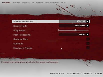
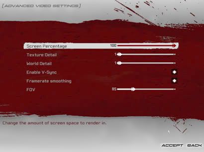
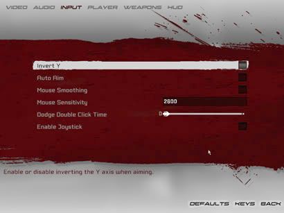
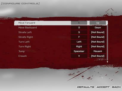
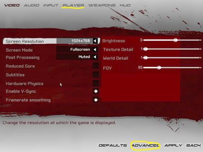
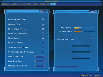
Okay so Ive compared a few different games with UT3 but now Im gonna go into some depth on UT3's GUI and areas where I think it could be improved. Not only to lessen the clicks but to improve screen space and make things easier to navigate.

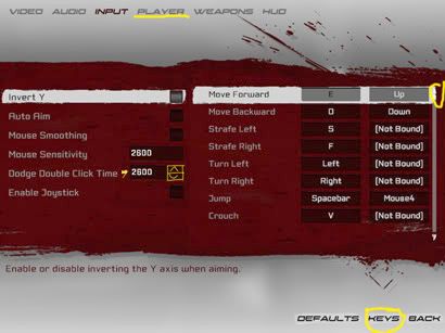
One of the most problematic things I think is that alot of pages have a button down the bottom to get into the other half of the options. So I did some mockups of a 2 column layout (yes they are ruff) but it gives you can example of how more options can be put on the same screens without changing the UI graphics dramatically.


So after the modifications they look like...


Now perhaps these look alittle cramped but if I took some more time Im sure I could get them to look really nice while having all those options on the single screens. It removes the need for those buttons down the bottom which numerous people say they dont see or just dont realize are there. That could also be because they are white on an almost white background with only the text visible but those buttons so work better to break the space between when compared to the tabs which are pure text, the tabs however do colour for the one you have selected.

I do think its possible to improve the tab bar along the top some to make it more noticeable whats selected and where the tab breaks are.

With the video options it could be better to put the 4 sliders along the top with the rest of the options split between 2 columns along the bottom. At the moment with what Ive done here the sliders do look alittle out of place.

The Input options and keys though there isnt really anything obvious to show that only the keys part is scrollable and the rest isnt, perhaps both could be or something could be done there. Like perhaps putting a grey background or black background there so its obvious which bit is the scrollable piece. More like the mutator menu as seen further down for eg

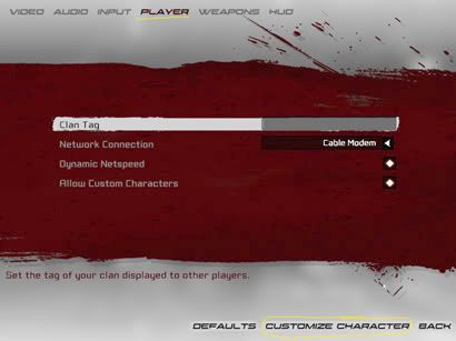
Now onto something which I see as a major fault...


This page is called player, wtf does it do? Seems to me its purely for putting in your clantag if your so inclined as the login page deals with player names etc. Maybe its there to get to the customize character and thats it which could be done on the gametype tab or even on the server browser perhaps. Im just confused as to why this is even here. Which kinda goes onto the next one.


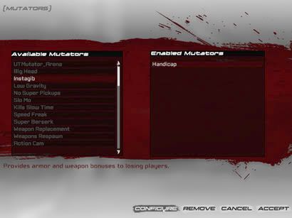
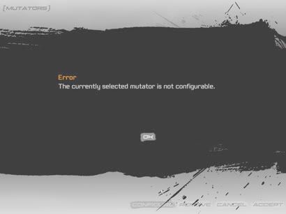
Why is this screen that says mutator not configurable even here? It would be much easier to grey out the configure button if no UIScene is given in the ini or something like that.


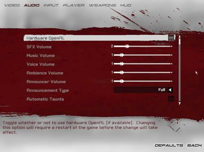
One area I think UT3's menu does really well on is this page, the audio options. Plenty of options, its neat clean, uses the screen space well and for what couldnt be fit onto the single page there is a scrollbar which doesnt require a large amount of scrolling to get to options.


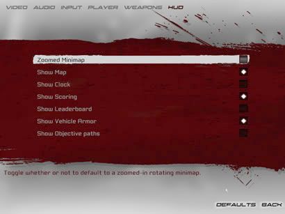
This page could certainly use acouple more options like show/hide portraits (maybe thats in there and I dont know) but yeah it could be done like the scroll menu on the audio which could be a universal style which goes across the joining of advanced video and video for eg. Or it could be like Ive been suggesting with the two column layout as in the Customizable UT mutator menu's.

Something to note about those as well is the heading for the sliders is above the slider not to the side which does work okay as well.

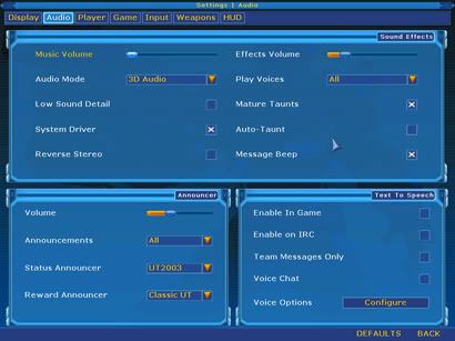
I think alot of the pictures show that theres always room for improvement on any interface. I dont think theres one here anyone would say is perfect and I wouldnt even agree if anyone says UWindows was perfect because there was plenty of area's which could have been improved on. Certainly not the best for screen usage because of all the popup windows but the text scaling was better and had a setting for doubling the text size for higher res or screens you perhaps arnt sitting as close to.

Scaling the text could certainly help to improve UT3's interface as Epic did on the server browser. Something else to note is 2k4, 2k3 and UT3's UI's all suffer from having smaller list boxes for scrolling so there will be alot of that. Scaling the text helps save scrolling because more options can be seen at any one time.

Another thing I think needs to be improved is showing which tab a person is actually on by blocking it off some like the buttons are.

On a whole though UT3's menu is okay but thats all it is, its not brilliant and its not shockingly bad like some of the others Ive posted. I hope some of my suggestions perhaps spark some ideas on improvements in coming patches because I dont think we need a total UI overhaul which is the same thing I thought back with UT2k3 but it happened anyway. UT2k4's UI does have its up points but it certainly has its down as well, as I said though not even the awe inspiring Uwindows is perfect so perhaps we can get some ideas going on options to add without going over the top and ways to improve the current UT3 UI.

I think that would be best instead of saying oh it sucks cause I said so!
 

MonsOlympus

Active Member
May 27, 2004
2,225
0
36
42
I dunno they could do, Id hope they atleast browse this thread. I could be on ignore for all I know though.

Feel free to rip my ideas a new one if you dont agree though hey, Im all for having a good discussion on this one :)
 

Trynant

Manic Brawler
Jan 31, 2002
2,019
1
38
Quiet Island
trynant.wordpress.com
Didn't WT state recently that they read through all the threads here and on the Epic forums?

yup, they do.

Crotale said:
I get a kick out of how many people on here are now saying that the UT2004 menu was decent, when the previous consensus was that it was a turd. Oh, the irony! How many advanced options does that menu have? Quite a few. But in my experience, most players that would use such features went to the .ini for their advanced settings.

That's the thing. UT3 UI makes the UT2004 UI look good. No offense meant; it's just how it is. Like I said, things are improving, and thankfully the game is great fun.
 

Kantham

Fool.
Sep 17, 2004
18,034
2
38
They pretty much obviously know the UI is so console-ish. The question is, will they add these things we are crying for?
 

BigDragon

New Member
Jan 20, 2008
82
0
0
Reston, VA
Yeah, true, but do they need their noses perpetually rubbed in it?
Until it's fixed, yes. Otherwise they'll try to ignore it like they did after all the complaints from the beta demo. They thought they could ignore the UI issues or play down their significance then, but these issues just won't go away so now Epic is admitting the problem.

I don't see how this is rocket science to them. Why would you not fix the UI when so many people complain about it? When a map has a visual or gameplay element that's flawed you can just simply avoid that map. When it comes to the menu you cannot avoid it. No matter what you do in any game, you must always use the menu. If Epic fixed the menu they'd easily sell more UT3's and get a lot of people off their backs. Instead, they're turtling up about the UI.

Personally, I haven't been harping on the UI like I have some other major bugs. The UI is clunky, yes. I have yet to find a way to (or invest the effort into) disable or simplify that blurred out map that shows up in the background. That stupid thing slows down my mouse cursor and seems to be responsible for the UI not being entirely sure where your mouse is or what you're doing with it all the time.
 

Sir_Brizz

Administrator
Staff member
Feb 3, 2000
26,020
83
48
Hey Sir_Brizz, I just hope you're not one of these guys that just want to hear what they want to hear. ;)
We know you love to defend UT3 on this forum, but you got to admit the UT2004 UI is WAAAY better than UT3's.
No I don't. I think they are both pretty awful in different ways.
 

Lethargy

Darmok and Jalad at Tanagra
Feb 24, 2006
277
0
0
No I don't. I think they are both pretty awful in different ways.

Alright... envision this scenario in your mind's eye, if you will. You are playing UT3, and you are in a server, but you aren't having a great time. The server is nearly full and you know that if you leave somebody may take your spot. You want to look for another server without losing your spot in the current one. What do you do? WHAT DO YOU DO? .:eek::eek::eek::eek::eek::eek::eek::eek::eek:
Now imagine the same scenario in UT2k4, and see how you fare. Then compare the differences.
 
Apr 11, 2006
738
0
16
Until it's fixed, yes.

In my opinion, it's attitudes like this that get people's opinions ignored in the first place. Epic is full of smart guys who I'm sure can get the message after 50,000 posts of people saying, "This UI sucks." Continuing to harp on a known and acknowledged issue comes across as pretty arrogant to me. Why should Epic want to interact with the community if you're just going to hold every screw up over their heads?
 

Crotale

_________________________ _______________
Jan 20, 2008
2,535
12
38
Anywhere But Here
Yeah, some of you may be more than disappointed with UT3 for whatever reason, but you should keep in mind the fact that companies like Epic are made up of employees who are talented and devoted to their work. I'm sure than no one who worked or is working on UT3 wanted to put out a not-so-well-received game. Is it really so difficult to stop the incessant whining and try giving the hard working artists and coders that created and support UT3 a little bit of credit where it is due?
 

Sir_Brizz

Administrator
Staff member
Feb 3, 2000
26,020
83
48
Alright... envision this scenario in your mind's eye, if you will. You are playing UT3, and you are in a server, but you aren't having a great time. The server is nearly full and you know that if you leave somebody may take your spot. You want to look for another server without losing your spot in the current one. What do you do? WHAT DO YOU DO? .:eek::eek::eek::eek::eek::eek::eek::eek::eek:
Now imagine the same scenario in UT2k4, and see how you fare. Then compare the differences.
That is only one small part. That's like saying "Compare clicking on the settings button in UT3 to clicking on it in UT2004". There's really no point. I may not be able to do what you've said in your post in UT3 and able to do it in UT2004, but for everything I could do in UT2004, there was something else irritating about it. For example, if you try to join a server in UT2004 mid-game and it fails, you still get ejected from the game you're in. Wow! :p
 

Grobut

Комиссар Гробут
Oct 27, 2004
1,822
0
0
Soviet Denmark
You're talking very specific semantics. I'm talking about the menu system in whole. You're talking about the settings area of the menu system.

No i am talking about the menu system as a whole aswell, all menu's regardless of ourpose are just a series of buttons, checkboxes, sliders and whatever, granted, there's usually also some 2D art involved, but it is not required.

I don't remember UT2004 having an advanced menu option (particularly at release) and I'm positive that UT2003 had nothing like that.

Incorrect, there was a "show advanced options" checkbox both in video options and in Instant action (in the game rules tab).
UT3 could do well using the same system, as i allready pointed out, it could even cover more of the menu's, i woulden't care, aslong as the menu's remember what i set the checkbox as i'd be fine with that, just give me moar opshionz!

And I'm not saying that they shouldn't add more options top the UI, I'm simply saying that there ARE reasons to have less options on the UI, even on the PC.

And im just saying thou art wrong kind sir.

Again, add a "show/hide advanced options" checkbox and all will be well.

Hell add a "show super duper advanced options" box too if it pleases you, i'll just set that one to true aswell so i can have even more options.

Arguably, yes. How many casual gamers do you know that HAVE TO be on the blue team, rather than just having the teams as even as possible?

And the casual gamer doesn't need the majority of options that were in the UT2004 UI or the CoD4 UI, honestly. Dragging a couple of sliders that make comon changes is a lot more intuitive for someone that doesn't know or care about "Pixel Shader 3.0b" or "Normal Maps" or even something as simple as "Anisotropic Filtering" or "Antialiasing".

If we allow the people with the least amount of demands, wants and needs to rule, we wont get very far at all now will we?

So what if the casual gamer doesen't care about this or that option, i do!
If he gets his way i'm boned, if i get my way, there will be a button there he has to ignore (ohh the horror!), what's really the worst case scenario there?

Besides, i allready mentioned the ideal compromise (show/hide advanced).

What options are missing that you would ever want to change on the fly? To me that sounds like "in the middle of playing the game" and the options you have talked about in this and other posts are things you wouldn't ever want to (or, more specifically, need to) change on the fly.

Im not talking ingame, im talking between rounds, for instance i want to setup my own teams, choose exactly what bots to use on either side (even if they are all the same bot, sometimes thats fun), i want to customize them, give them default orders that make sence according to the roster i've made, and favorite weapons that make sense with their orders, i want to disable Bright skins, i want to play on blue team like i allways have, i want to tweak freindly fire scale, i want to tweak spawn protection times, i want to disable auto-taunts, i want to decide if teams should swith places after a match, i.. basically want all the stuff from 2k4 back, and i would also like even more! but i can settle for what 2k4 had.

And I already addressed this. The options you are talking about didn't exist in UT2003, and the only plausible reason they DID exist in UT2004 is because people had already built them for UT2003. I did play a TON of Instant Action in UT2003, and the opnly options I really ever changed were on the game configuration screen, maybe the bot rosters and mutators. I'd be surprised if heavy customization was something most people really wanted in that area of the game. In addition, I almost exclusively played Instant Action in UT, and I never found a use for all of those deep customization menus (that were available through mutators). I want to play the game, not tweak the bots to pinpoint values.

2k3? what has that got to do with anything!? it too lacked some of the options i wanted (i recall it also did not have a preffered team option at launch for one, really annoyed me then too untill they patched it).

And i still dont care what options you liked or used, you are not me, i am not you, and there is no good reason why we can't both get what we want through smart design.
And if some of thease options where infact community made, doesen't that just go to show that the community wants them?