Official BeyondUnreal Photography Thread

  • Two Factor Authentication is now available on BeyondUnreal Forums. To configure it, visit your Profile and look for the "Two Step Verification" option on the left side. We can send codes via email (may be slower) or you can set up any TOTP Authenticator app on your phone (Authy, Google Authenticator, etc) to deliver codes. It is highly recommended that you configure this to keep your account safe.

OO7MIKE

Mr. Sexy
May 2, 2000
5,033
124
63
Nalicity, NC
My fellow photographer and I got together with the intent of doing head shots for our wedding website. While we got some good shots, we had more fun after the serious shots where done. For being photographers, its very hard to get good shots of ourselves.

I went for a very rugged film noir sort of look. It's a very new experimental processing i've been working on and I am totally loving!

Michael_SHP6947.jpg


Sean_SHP6909.jpg
 

Lruce Bee

Transcending to another level
May 3, 2001
1,644
3
38
Sherwood Forest
Same here - an over-processed image looks interesting amongst a selection of standard photos but seen side by side you see them as a collection of hackneyed images only instead of something that surprises you.
I think someone has already mentioned that Gears of War & UT3 suffered from the same fate with overuse of bloom etc - what should be a cool visual asset becomes something almost despised - it's weird.

Edit - 2nd shot looks weird Mike - Guys head is sun-tanned but his hand is almost pure white.

Lruce
 

Hazel.H

Member
Jan 15, 2004
700
0
16
I just bought a Canon 450d, really pleased with it so far.

[SCREENSHOT]http://farm4.static.flickr.com/3303/3434451806_7b1181b90e_o.jpg[/SCREENSHOT]

The easter eggs are made from real eggshells and wood, not chocolate :(
 

OO7MIKE

Mr. Sexy
May 2, 2000
5,033
124
63
Nalicity, NC
Edit - 2nd shot looks weird Mike - Guys head is sun-tanned but his hand is almost pure white.

Lruce

Your right, that does look a little off. I just know is hand was over exposed in the shot, probably why I didnt do anything about it. I'll have to work on that some more.
 

Crotale

_________________________ _______________
Jan 20, 2008
2,535
12
38
Anywhere But Here
Nice one BBA. What filter/lens do you use to get that style, as I've noticed a similarity in most of your photos?
______________________

First up for me is the Rock'em Sock'em Robots at the New York New York Casino. I forgot to enable the flash, so it's a bit darker than I would have liked, as they are featured in a black curtained area. The second photo is an HDRish shot with the Eiffel Tower and Pranet Horryrood in the background as shot from the New York New York entrance. I left my tripod in the car, so these are freehand shots.

rokmnsokm.jpg


ny2paris.jpg
 

BillyBadAss

Strong Cock of The North
May 25, 1999
8,880
61
48
49
Tokyo, JP
flickr.com
Nice one BBA. What filter/lens do you use to get that style, as I've noticed a similarity in most of your photos?
______________________

First up for me is the Rock'em Sock'em Robots at the New York New York Casino. I forgot to enable the flash, so it's a bit darker than I would have liked, as they are featured in a black curtained area. The second photo is an HDRish shot with the Eiffel Tower and Pranet Horryrood in the background as shot from the New York New York entrance. I left my tripod in the car, so these are freehand shots.

rokmnsokm.jpg

I am using a Canon 1.4 50mm lens with no filter. The style comes from Photoshop post processing 32 step technique.

I think I like it better without the flash. It makes it more dramatic. I think the flash would of taken that all away. I try to use a flash as little as possible.
 

sid

I posted in the RO-me thread
and all I got was
a pink username!
Oct 20, 2005
2,140
0
0
Dont remember if Ive posted this one before.
3164569408_bc9957f628.jpg
 

sid

I posted in the RO-me thread
and all I got was
a pink username!
Oct 20, 2005
2,140
0
0
Im not sure I understand, can you please elaborate, itll be a great deal of help. Thanks :)
 

Zur

surrealistic mad cow
Jul 8, 2002
11,708
8
38
49
I think he means you should center on the subject if the resolution allows it. In other words, a close-up in cinema speak.
 

sid

I posted in the RO-me thread
and all I got was
a pink username!
Oct 20, 2005
2,140
0
0
Oh I see, thanks Azura. Whatever photography Ive done till now has been done through my stock lens for the D40 hence the lack of zoom but I guess for the respective image this should suffice,

[SCREENSHOT]http://g.imagehost.org/0547/DSC_0449crpdrestune.jpg[/SCREENSHOT]
 

OO7MIKE

Mr. Sexy
May 2, 2000
5,033
124
63
Nalicity, NC
Im not sure I understand, can you please elaborate, itll be a great deal of help. Thanks :)

Your new crop is much better but the composition is off. Your subject is too centered. Although it calls immediate attention to your subject but (and i mean no disrespect) the composition is amateurish. Its a commonly learned trade to center your subject. Your parents did it, their parents did it. You looked at all of the family photos when you where young and learned to do this so instinctively you do this without even thinking about it. It isnt always easy thing to unlearn and it is what sets Joe Average from a Pro.

Your subject should almost never be centered. Rule of thirds is a well established way to compose your subjects and make them interesting. Turn on your TV or fire up your favorite movies.. you will notice that in almost every scene your favorite actor or actresses has been framed on one side or the other. It really depends on what side they are facing. There are of course exceptions to the rule which can be fun to play with.

I'm not saying you can't take photos of your subjects with them in the center, (especially when your subject is a fast moving bird and your focus point is in the center) just understand that you will need to fix your composition in post to make it more interesting.

Here are three examples of how to fix it using the Rule of Thirds with an 8x10 crop:

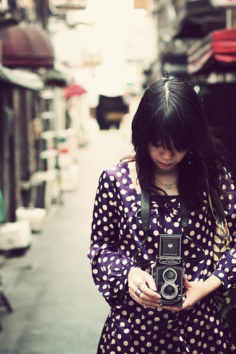
Example 1: This shot has the "dead space" or empty space in front of the subject. Now the subject looks like it is moving forward in motion instead of standing still. Good composition but not great.

Example 2: This shot has a tighter and more balanced composition than example one, however it has too much dead space in front of the subject.

Example 3: With some digital rotating you have instantly solved the angle/direction problem with the subject, thus allowing for a tighter portrait crop which allows only a small amount of dead space in front of the subject. This image can be further cropped on both the top and the left sid but we are already loosing so much resolution. Over all the composition is much more interesting and your photo is more filled with the subject than dead space.
 

Zur

surrealistic mad cow
Jul 8, 2002
11,708
8
38
49
I like n°3 the best. That thirds rule makes sense in that it should give some perspective (think vanishing point). On another note, have you ever used the golden ratio in any of your work ?
 

OO7MIKE

Mr. Sexy
May 2, 2000
5,033
124
63
Nalicity, NC
On another note, have you ever used the golden ratio in any of your work ?

Just look at my website! I pimp the golden ratio on my front page. I don't use it otherwise. Although very pleasing to the eye I find it as impractical as cropping my photos to 16x9. People love their 8x10s
 

sid

I posted in the RO-me thread
and all I got was
a pink username!
Oct 20, 2005
2,140
0
0
Hey thanks man, that really helped, my bro too had sometime back tried to explain me the concept of handling space but your effort seperates the 'dos' from the 'donts', the third one there makes it so much clearer, really really appreciate it :D

How about this one?

n575508067_1636631_2556595.jpg
 

sid

I posted in the RO-me thread
and all I got was
a pink username!
Oct 20, 2005
2,140
0
0
Thankyou sir, may I say that the pic with the dog is really cool too :)