A bowling shirt might be cool. you go and get your tag put on the front and the BUA logo on the back ( like we were sponsered), or how about a Soccer jersey. Possiblities are endless. This is begining to sound to me like we need to all meet up at a LAN party somewhere. Things that make you go Hmmmmmm.
New Logo! Need Input!
- Thread starter Bonecrusher
- Start date
-
Two Factor Authentication is now available on BeyondUnreal Forums. To configure it, visit your Profile and look for the "Two Step Verification" option on the left side. We can send codes via email (may be slower) or you can set up any TOTP Authenticator app on your phone (Authy, Google Authenticator, etc) to deliver codes. It is highly recommended that you configure this to keep your account safe.
You are using an out of date browser. It may not display this or other websites correctly.
You should upgrade or use an alternative browser.
You should upgrade or use an alternative browser.
TAZTG said:Why would someone else buy a BUA shirt?? They might buy a BU product. Alrighty so what we decided is to finalize a logo and tshirt, then everyone can get their own shirts done. Sounds good to me..
TAZ, there are others who would support individual members, I can think of 2 or 3 people on my side alone who might buy shirts with our logo on it just to support my being in «BuA».
Not to mention that it would help out QAPete and others in BU, while getting our shirts done professionally, and maybe even reasonably priced.
I was planning originally to get my own shirt done myself, however... so if that ends up being the course of action we take, then so be it.
BT had some interesting ideas, there. How about, instead of listing everyone's name on the back, we would just have the name of the individual getting the shirt, jersey-style? There could then also be blank names for peeps that don't want their names on the shirt. Whacha think?
That might be cool...I like that idea. I was thinking about stuff to put on the back...and when I enlarged our "X" ... It actually looks really cool when it's real big and detailed.
Lets see some PICS of the Front and Back. I know the BuA Logo is sweet, what about Members Name. What Font and Style will be used??
I kinda like the Font BC, used in my SIG.
I kinda like the Font BC, used in my SIG.

First, keep it simple. I would say no sig. Second, ditch the "Unreal Tournament 2003" logos. They are pretty lame. Then put the rest of that pic dead center on the back, the player's name whose shirt it is jersey style above that, then just the «BuA» logo on the "pocket" on front, though the shirts themselves don't need pockets. Make the shirts black, and they'd look pretty awesome. Only thing to decide would be what font to make each player's name. To keep with the K.I.S.S. principle (that's Keep It Simple, Stupid; for those that don't know), I would suggest keeping the same font and color for all the lattering on the shirt. That would mean whatever font the logo is in now. I would go for that shirt.
On closer inspection of the BuA logo, I'd lose those little squares around the lightning bolt X's, too.
By saying the logo on the "pocket" ... do you mean in the upper corner or centered on the front. I'm trying to picture which would look better.
A pocket is usually on the left breast of a t-shirt. When there is a picture there, it is said to be on the pocket, regardless of if the shirt actually has a pocket or not. You've never seen a t-shirt with a pocket?

Personally TAZ, if this is the shirt yer putting together for yourself, I say; Do what you want. Yer the one who's gonna be wearing it... so if you want a 1/2 nekkid female with a «BuA» tattoo... then more power to ya. 
Oh, if TAZ is only doing a shirt for himself, he can do whatever he wants. But I was thinking more along the lines of "team" shirts, in case we ever did get together for a LAN party or something.
«BuA»Lurker_71 said:Personally TAZ, if this is the shirt yer putting together for yourself, I say; Do what you want. Yer the one who's gonna be wearing it... so if you want a 1/2 nekkid female with a «BuA» tattoo... then more power to ya.
Send that one...
Don't make me laugh, TAZ. You wouldn't settle for only an half naked female. She'd half to be at least 90% naked for you to be satisfied.
The more naked the better, I would say. I have afew pics I was thinking of using but I can't post them here.
Shattered_Steel said:Don't make me laugh, TAZ. You wouldn't settle for only an half naked female. She'd half to be at least 90% naked for you to be satisfied.
90% ??
Do I wanna know?

«BuA»Lurker_71 said:90% ??
Do I wanna know?
You ever hear of a G-string? TAZ once sent me a pic he liked of someone wearing a "dental floss" version. You get the idea.
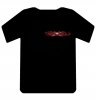
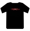
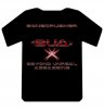
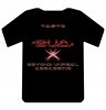
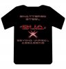
ok...forgetting about the nekkid idea, i think this is sorta what steel is picturing if I understood correctly.
Feedback plz
Two fronts (I like it centered better) three backs
Feedback plz
Two fronts (I like it centered better) three backs