Well, man, it took me some time to navigate this one! ;-) I don't see anything particularly next-gen on those tiles - except lighting/shininess that changes while I rotate my camera (which is strange).
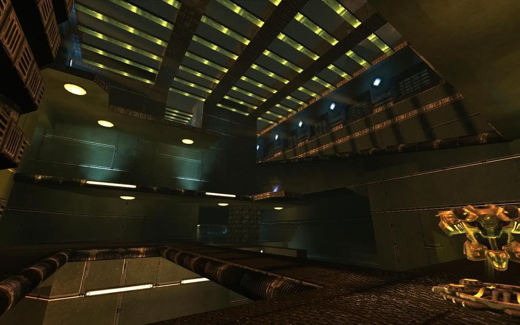
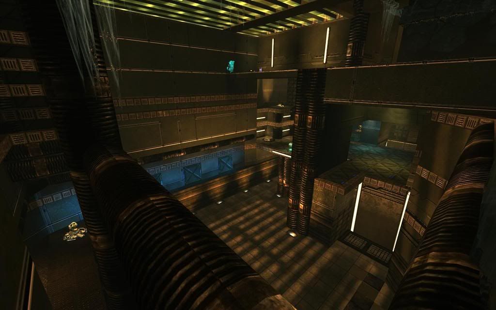
There are two big distinct rooms - belt and b-plate room. Between them you can navigate on ~4(!) layers (it reminds me DM-UCMP2-Adamantium) via various twisted routes. What I see as interesting is how close - and yet how far - are udamage and belt. That is good. Although I don't like the udamage room so much, because you need to camp single end of the room to keep all enemies out - put more danger in it - more directions.
Some corridors are... too corridorish, I'd make them straight (if it's possible). For example helmet-health-udamage room is quite long comparing to wide and open spaces of two big rooms. When we're here - I see them way too open - and snipers are always more or less in them (both of them) and up there... that's bad. Sniper is available and immediately usable.
I like teleport wall ;-) - although I don't see reason for the teleport, because both ends are quite close - although via traditional route you made it to be far, because you twisted these routes more than necessary. I mean - good point is, that the layout is interesting and always keep you busy thinking about various paths.
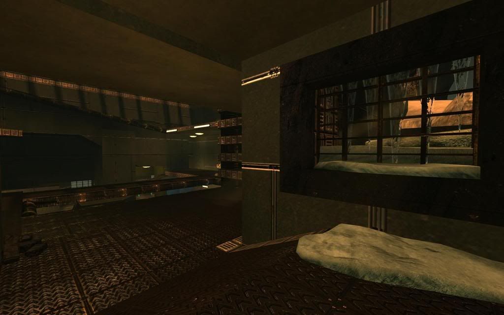
I'm sure connectivity is good - I'd say it should be a bit more straight, but it's good. I'm not sure on the other hand, if there isn't way too much connectivity (as Taleweaver said once... "the only way how to follow your opponent is going directly after him" or something like that). Some paths are more tricky than usable (but I can see players who can rule the map using them) - like the one via sloped ledges joining two "red vents" (I hope you know what I mean). Ah, red vents... some grates can be passed through - some can't. That's against WYSIWYG principle and please try to make it clear. Going through grates? C'mon, that's... inconvenient. ;-)
The rest... visuals are that indiferent tech theme I like variations you made on various places - like "ah, here's that blue-lights floor!". That's good. You however overused sunbeams... some even go through bsp ramps. ;-) Sunbeams going from windows on both sides of room? And where is that sun btw? It doesn't exactly match the skybox.
The map is interesting, but I'd made it just a bit more straight. Not straight like "here is long corridor and I have my sniper rifle, muahaha", just make the ways shorter preserving current interesting point of the map. I like many trick jumps (nice lift jumps possible, jump from the ledge near belt to that unstuck neon light, ...), map is interesting, keep good things that result from the relative complexity of the map and take away the unnecessary features. Just walk through and ask yourself "what can be made simpler while it remains interesting?"
Of course... just my opinion and maybe you should wait for another one. ;-)


)") )
)