UT3 DM-Apex

  • Two Factor Authentication is now available on BeyondUnreal Forums. To configure it, visit your Profile and look for the "Two Step Verification" option on the left side. We can send codes via email (may be slower) or you can set up any TOTP Authenticator app on your phone (Authy, Google Authenticator, etc) to deliver codes. It is highly recommended that you configure this to keep your account safe.

Numb51

New Member
Feb 3, 2008
100
0
0
BETA-APEX

Screenshots

Version3.jpg


Version2.jpg


Version1.jpg


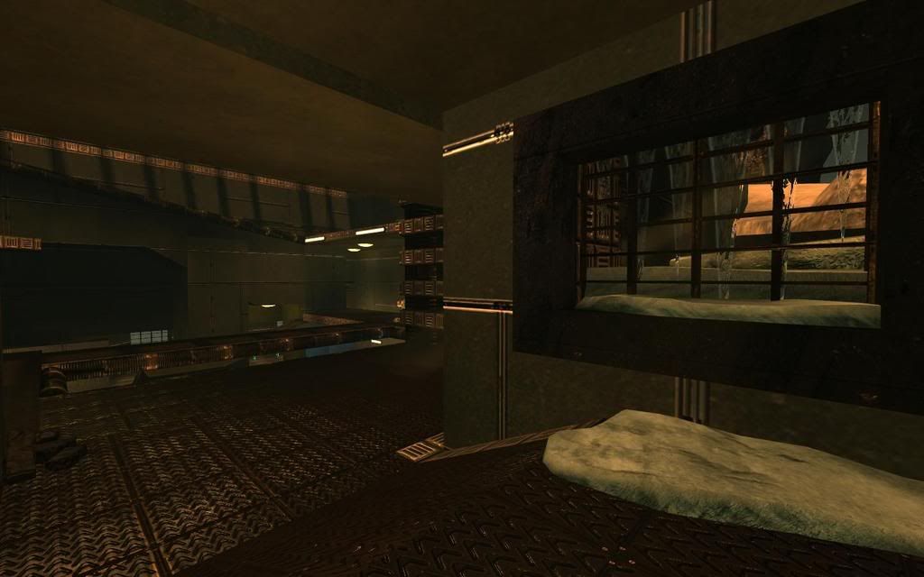
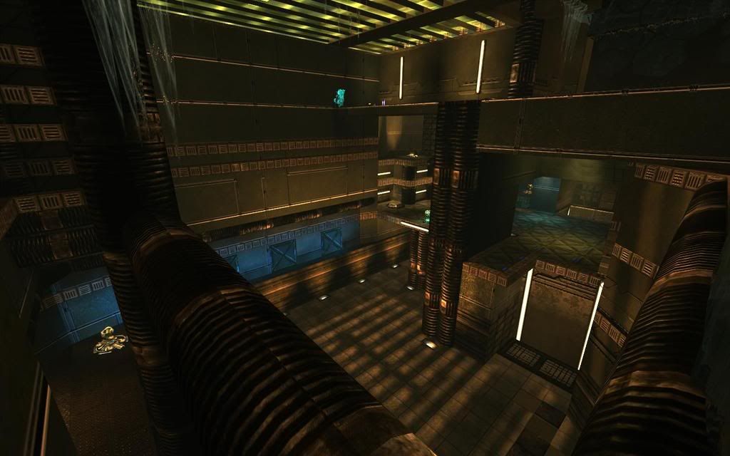
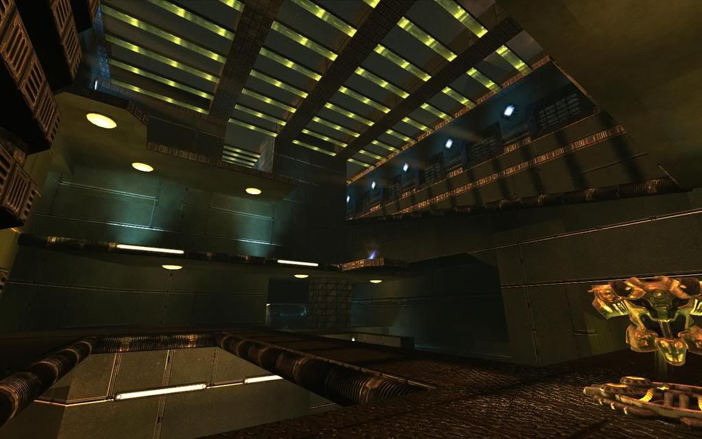
**This is about as high poly as the areas will get. Because I plan on making it look low poly, i've incorporated NEXT-GEN physics to some areas. For instance, in the shieldbelt room there are these small tiles on the ground. They are loose and can be shot around. I wouldn't Implement something that doesn't work with gameplay, and seeing as the movable tiles aren't even noticed when 1v1ing then it's a good sign.

**I know the icile things look absolutely rediculious, hopefully i'll change that soon.

***Keep in mind, this is a competitive map, so the decoration won't get that good.

Download
 

virgo47

Waiting for next UT
Jul 5, 2005
428
0
0
45
Bratislava, Slovakia
members.clanci.net
Well, man, it took me some time to navigate this one! ;-) I don't see anything particularly next-gen on those tiles - except lighting/shininess that changes while I rotate my camera (which is strange).

There are two big distinct rooms - belt and b-plate room. Between them you can navigate on ~4(!) layers (it reminds me DM-UCMP2-Adamantium) via various twisted routes. What I see as interesting is how close - and yet how far - are udamage and belt. That is good. Although I don't like the udamage room so much, because you need to camp single end of the room to keep all enemies out - put more danger in it - more directions.

Some corridors are... too corridorish, I'd make them straight (if it's possible). For example helmet-health-udamage room is quite long comparing to wide and open spaces of two big rooms. When we're here - I see them way too open - and snipers are always more or less in them (both of them) and up there... that's bad. Sniper is available and immediately usable.

I like teleport wall ;-) - although I don't see reason for the teleport, because both ends are quite close - although via traditional route you made it to be far, because you twisted these routes more than necessary. I mean - good point is, that the layout is interesting and always keep you busy thinking about various paths.

I'm sure connectivity is good - I'd say it should be a bit more straight, but it's good. I'm not sure on the other hand, if there isn't way too much connectivity (as Taleweaver said once... "the only way how to follow your opponent is going directly after him" or something like that). Some paths are more tricky than usable (but I can see players who can rule the map using them) - like the one via sloped ledges joining two "red vents" (I hope you know what I mean). Ah, red vents... some grates can be passed through - some can't. That's against WYSIWYG principle and please try to make it clear. Going through grates? C'mon, that's... inconvenient. ;-)

The rest... visuals are that indiferent tech theme I like variations you made on various places - like "ah, here's that blue-lights floor!". That's good. You however overused sunbeams... some even go through bsp ramps. ;-) Sunbeams going from windows on both sides of room? And where is that sun btw? It doesn't exactly match the skybox.

The map is interesting, but I'd made it just a bit more straight. Not straight like "here is long corridor and I have my sniper rifle, muahaha", just make the ways shorter preserving current interesting point of the map. I like many trick jumps (nice lift jumps possible, jump from the ledge near belt to that unstuck neon light, ...), map is interesting, keep good things that result from the relative complexity of the map and take away the unnecessary features. Just walk through and ask yourself "what can be made simpler while it remains interesting?"

Of course... just my opinion and maybe you should wait for another one. ;-)
 

Numb51

New Member
Feb 3, 2008
100
0
0
"I don't see anything particularly next-gen on those tiles - except lighting/shininess that changes while I rotate my camera (which is strange)."

The Tiles can be shot because they're kactors. I do have a question about the kactors though. Do you know the variables i need to change in order for it to not have the very sharp shadows on it. They seem like they have a lightmap resolution of 1 and it really hurts performance.

"That's good. You however overused sunbeams... some even go through bsp ramps. ;-) Sunbeams going from windows on both sides of room? And where is that sun btw? It doesn't exactly match the skybox."

HAHA! Thanks for pointing that out. I completely forgot that that effect could only happen from one side. However, what if the whole entire sky box was extremely bright?

"helmet-health-udamage room is quite long comparing to wide and open spaces of two big rooms. When we're here - I see them way too open - and snipers are always more or less in them (both of them) and up there... that's bad. Sniper is available and immediately usable."

I pretty much tried to make it as long as possible. This map was originally a 1v1 map, but I decided that since no one really plays any custom tdm maps then i'd give it a try to make one. Anyway, I added the amp room at the last second, and i believe it turned out pretty well. As far as the long corridor to the health-helmet, I made that just to add more time to traveling, so the map wouldn't be too hectic for 1v1.

"Ah, red vents... some grates can be passed through - some can't. That's against WYSIWYG principle and please try to make it clear. Going through grates? C'mon, that's... inconvenient. ;-)"

Now that I think about it, when we 4v4 the map, most people don't try and go through the grates at all, so I'll definitely remove the grates that people can walk through.

As for the map's complexity. I'm a hardcore 1v1er/tdmer and i play ALOT, way to much actually. I believe that the more complex the map is, the longer the replay value will be since every time the map is played, something new always pops up.

Oh and virgo, I really really appreciate the amount of effort you put into your reply. I'd have never expected this because for some reason, every time I post versions of my maps here, they get little to no responses. Thanks again!
 

virgo47

Waiting for next UT
Jul 5, 2005
428
0
0
45
Bratislava, Slovakia
members.clanci.net
The Tiles can be shot because they're kactors.

I know... unless UT2004 was "next-gen" as well - it's not next-gen. :)

I completely forgot that that effect could only happen from one side. However, what if the whole entire sky box was extremely bright?

Yeah, I was thinking about it as well, I don't deny it completely as impossible. But your skybox isn't that bright. And it can't be that bright to go through that bsp. :p

...no one really plays any custom tdm maps then i'd give it a try to make one.

I guess it's just the state of UT3 game now. It's not how things are normally in normal game. :)

Anyway, I added the amp room at the last second, and i believe it turned out pretty well. As far as the long corridor to the health-helmet, I made that just to add more time to traveling, so the map wouldn't be too hectic for 1v1.

Time to travel isn't that good if you meet bot there and you don't feel like fight it. Narrow corridors are spam-prone and if you need to go through something for just a few more seconds - it's more risky than you really want. The map is big enough even without these "time to traveling". DD room - think about that camping issue I mentioned. I bet T2A' could write an essay about it, but he already did it for Sentinel. Udamage is risky because it's (sort of) dead-end, but on the other hand it's easily defendable. You have perfect cover for your back there. Easy deal if you have good health+shield. That's bad.

As for the map's complexity. I'm a hardcore 1v1er/tdmer and i play ALOT, way to much actually. I believe that the more complex the map is, the longer the replay value will be since every time the map is played, something new always pops up.

I know what you mean (I guess), but look at the Ironic. That's simple map (more or less) and it's superb. It actually can work. But of course - complex things can work too - if players like it.

Oh and virgo, I really really appreciate the amount of effort you put into your reply. I'd have never expected this because for some reason, every time I post versions of my maps here, they get little to no responses. Thanks again!

No problem... when I have a mood, I write a lot. ;-)
 

Jelle Mees

New Member
Mar 15, 2008
19
0
0
The map reminds me of Stargate Atlantis interior design. Nice! I love it!
You should have added map preview for menu though, I would like that very much.

High-Res screenshot:

[SCREENSHOT]http://i240.photobucket.com/albums/ff312/JelleMees/Unreal%20Tournament%203/sshot-15-2.jpg[/SCREENSHOT]
 

Grogan

New Member
Anyone notice that there's a spawn point in this map that the bots always seem to emerge from? I can stand in one spot and get "double kill, multi kill, mega kill, ultra kill, monster kill" etc. with the sniper rifle :lol:

It's on one of the ramps.

Nice map though, for what it was intended to be.
 

Poker

Anus Retentus
Apr 17, 2006
310
0
0
Very nice layout. The grated ducts, well-placed lifts and pickups, and touches like the oblique-hanging meshes along the wall that allow wall dodging between platforms, all this easily shows that you really understand game play.

I completely understand the low-poly design, but having said that, it'd be great to see a fully meshed version that's decked out to push Engine 3 a bit. I say this only because of how great the layout is ... too often the UT3 maps that are built to take advantage of all the new visual features of the engine fail to also give appropriate attention to the architecture and how it contributes to solid DM play, the way this map does.

At any rate, nice work and thanks... looking forward to many plays on this map. :)
 

Numb51

New Member
Feb 3, 2008
100
0
0
Yeah, I'm working on a high poly version of the map right now. However, I don't know if i have the motivation to continue. The NA competitive community loves the map, but it'd be close to pointless in finishing it since there are only like 20 active tdmers that play the game. It's pretty sad really.

Btw thanks for the comment!
 

Mr. UglyPants

2007 never existed, it was all a dream.
Aug 22, 2005
1,984
0
0
34
Canada... eh
The map reminds me of Stargate Atlantis interior design. Nice! I love it!
You should have added map preview for menu though, I would like that very much.

High-Res screenshot:

[SCREENSHOT]http://i240.photobucket.com/albums/ff312/JelleMees/Unreal%20Tournament%203/sshot-15-2.jpg[/SCREENSHOT]

What player model is that?
 

bignick0193

New Member
Feb 18, 2008
32
0
0
The map reminds me of Stargate Atlantis interior design. Nice! I love it!
You should have added map preview for menu though, I would like that very much.

High-Res screenshot:

[SCREENSHOT]http://i240.photobucket.com/albums/ff312/JelleMees/Unreal%20Tournament%203/sshot-15-2.jpg[/SCREENSHOT]

132 FPS? What the hell batman thats sick.