
Do you like the new-look BU?
- Thread starter Selerox
- Start date
-
Two Factor Authentication is now available on BeyondUnreal Forums. To configure it, visit your Profile and look for the "Two Step Verification" option on the left side. We can send codes via email (may be slower) or you can set up any TOTP Authenticator app on your phone (Authy, Google Authenticator, etc) to deliver codes. It is highly recommended that you configure this to keep your account safe.
You are using an out of date browser. It may not display this or other websites correctly.
You should upgrade or use an alternative browser.
You should upgrade or use an alternative browser.
I have to be competely honest, I clicked the link under favorites, and I made a face of disgust when I saw it. For a second, before I realized the truth, I found it very ironic that I had somehow accedentally replaced such a beatiful website such as beyondunreal.com with something so 'bleh'. It was then that I saw the familiar POD on the right and the logo in the upper left corner.
Oh beloved Beyondunreal design, where art thou?
I believe, however, that I may eventually get used to the new design, so I rated it "OK".
Oh beloved Beyondunreal design, where art thou?
I believe, however, that I may eventually get used to the new design, so I rated it "OK".
I loved the old look. This new look is basicly horrible. I liked the old alot better due to it's metallic look and clean and easy overview. This new one is too much "OMG Future we have transparent things now ADORE IT!"
Which I don't like(I simply hate that look). The best thing about it is the new top where you can easily come around the parts of the site.
Which I don't like(I simply hate that look). The best thing about it is the new top where you can easily come around the parts of the site.
Last edited:
The older one was so much better, why that ugly look.
It feels Butched. The layout is too simple and fast to make. with a ugly blue-sky tint and ""skin"" like backdrop, wich make me think that the author did it to get rid of it quickly. it is even more butched since there is no border detailed but just that simple 1 px lines. I don't know how people can find it good TBH.
It feels Butched. The layout is too simple and fast to make. with a ugly blue-sky tint and ""skin"" like backdrop, wich make me think that the author did it to get rid of it quickly. it is even more butched since there is no border detailed but just that simple 1 px lines. I don't know how people can find it good TBH.
Last edited:
I opened my little favourites link this morning and almost made a mess in my pants.
I like it a lot.
I like it a lot.


Fresh, fresh, exiting... so exciting to meee
I really like it.
It's really fresh, and somehow feels a lot less cluttered.
It's only now I realise how bored I was of seeing the old layout.

The blue links on the main page need to go... something, as long as it's not the bog standard "this is a link blue"...
I really like it.
It's really fresh, and somehow feels a lot less cluttered.
It's only now I realise how bored I was of seeing the old layout.
The blue links on the main page need to go... something, as long as it's not the bog standard "this is a link blue"...
Last edited:
Bleh, the old one reminded me too much of PlanetUnreal... This one's clean, and individual.
Oh and Neme. Get a better res mate. With computer's we try to evolve our systems. You're still in 1996
Oh and Neme. Get a better res mate. With computer's we try to evolve our systems. You're still in 1996
Erm.. Blue links? Ouch.
I like the top bar, ok nice - the 'Main' cell at the top with top news and 'also' is cool, but i Hate 'whole page' pictures. They're just so tacky. The page is getting too busy now and it's just.. eye bleeding.
Ow.
I liked the previous template more, it was cleaner, better colours. This one looks like it's been done by a 12 year old trying to get 'more more more' ...
There's something to be said for clean, simple looks, with a dash of nicities and no clutter - www.clanci.net
I'll probably avoid the frontpage now, makes me cringe/wince.
What i'd like to see change:
Blue background? Blue Fonts? ! I'd rather see black fonts.
I enjoyed the rotating image. Although the skin idea's nice it's good to see something 'different' and 'unique' about the site like that.
Anyway - i'm off to get my eyes checked to see if i can actually still focus properly anymore.
Ugh
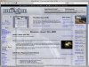
Er... the new look has the potential to be very nice, but it is borked for me if I'm not surfing full-screen (which I never do, ugh):

Er... the new look has the potential to be very nice, but it is borked for me if I'm not surfing full-screen (which I never do, ugh):

A
Aggression
Guest
I'm using Opera...just make sure you've upgraded to the latest version and it should display everything fine - no matter the window size.
[screenshot]http://www.unrealwp.frihost.net/printscreen/opera-bu.PNG[/screenshot]
[screenshot]http://www.unrealwp.frihost.net/printscreen/opera-bu.PNG[/screenshot]