Cloth - Wrinkles:
Created by : Redlemons
Tutorial copied with the friendly permission from Identity Crisis .
Introduction
Metal, flesh and clothing are what you're most likely going to see in a first person shooter game. Here's how to make one variation the latter.
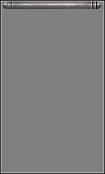
Step 1. Make a grey base
It's best to use a mid-grey base colour at the very start. Make the image any size you want, and you can add a pole up the top or another object that the material can hang from. Make this your base layer and add layers on top of this. Make sure you name your layers properly so you don't get mixed up.
Step 2. Shadows
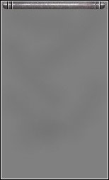
Make a new layer, call it 'Shadows' or something similar, and use a relatively large brush with a low opacity and hardness. Use solid black or a very dark grey. Put the shadows down gently because you can always tweak them later on.
Step 3. Highlights
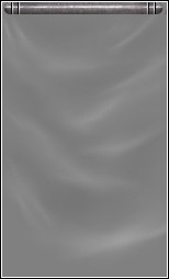
Now it starts to look a bit more like material and not, well, grey and black smudges. On a new layer, use white or a very light grey colour and use a brush about half the size of the one you placed the shadows with. You ma want to use a higher opacity for the highlights as they need to be quite a bit sharper than the shadows. As before, add them gently.
Take note of the way material hangs. In this example the material is hanging from two pints - the left and right ends of the metal rods. So, logically, the creases and wrinkles are going to be smaller and sharper than those down below. They need to be closer together, too. Keep at it, it will all come together after a bit of practice.
Towards the bottom of the flag it's a different matter. The wrinkles are broader and the shadows cast are usually a lot larger. Similarly, the highlights are more sweeping than those at the top.
Step 4. Adjust the brightness
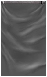
Obviously this step is optional. I found my image was a little too bright so I added a new Adjustment layer and altered the Brightness and Contrast levels until I was happy with the result.
Step 5. Give it some shape
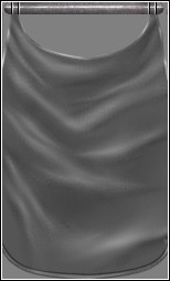
A rectangular flag isn't very exciting so I gave it some form by cutting out parts of the bottom and the top. Notice the parts of the flag attached to the rod are darker and have sharper wrinkles. The centre of the flag at the top is also cut out.
Normally, material has the edges folded over and sewn up to prevent it from coming undone. If you want to do the same and give it a more finished look, make a new layer with the blend mode set to Dodge. Using a mid- to light-grey colour, draw a strip around the edge of the material and adjust the opacity to suit. In darker areas (where there is shadow from the creases) you'll want to use a light eraser and erase these parts to bring more attention to the shiny parts.
Step 6. Colour
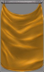
There are a million and one ways to colour your image. Choose which one you feel most comfortable with and colour the flag any way you want. For this example I added a new Overlay layer and laid down a solid orange colour. I then adjusted the opacity and added a few variations of orange (red, yellow, etc.) on the same layer and this is the result. You can also colour the image by using the Colorise command; Adjust Hue/Saturation/Lightness; Adjust Red/Green/Blue; overlaying a coloured texture etc.
Whichever method you decide to use, remember to add a few different colours to the flag to give it a bit more character. For example, if you have a blue flag, have some purple highlights. If you're creating a red flag, your highlights may be orange and yellow, too.
Step 7. Flair!
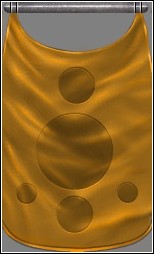
Flair is the difference between a flag and a bedsheet hanging from a pole. Add a design, picture, logo, words, different colours, anything to bring attention to the texture. In this example I selected a few circles and added a Brightness/Contrast adjustment layer. After fiddling around with this for a few minutes I was able to come up with the effect I wanted.
To get the lighter ring around the circles, create a Dodge layer and draw circles around the edges of the circles on the layer below. Use a light grey for this. Once you've done that, select them all and move them either up or down a few pixels. (See the Metal tutorial for more information on this effect). This will make the new circles look sewn in and not simply a different colour.
Step 8. Final touches
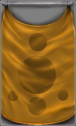
Now to make it look even more three-dimensional, add some sharper highlights and shadows on the material itself. Use a very small brush, only 1 or 2 pixels in width and a relatively high opacity. Draw these on separate layers to give you more control.
Now to make the flag look like it is separate from the background, go back to your very bottom grey layer and, using black, a low opacity and a large brush, gently draw in some shadows. Remember that the farther away from the wall, the larger the shadows will be. If the flag is resting against the wall only a small strip of shadow will be needed.
Conclusion
Pretty easy, right? It is. Use these methods to create creases and wrinkles for clothes, flags, banners, absolutely anything and everything. Depending on the type of material used your highlights will be sharper and stronger or less apparent.
Created by : Redlemons
Tutorial copied with the friendly permission from Identity Crisis .
Introduction
Metal, flesh and clothing are what you're most likely going to see in a first person shooter game. Here's how to make one variation the latter.
Step 1. Make a grey base
It's best to use a mid-grey base colour at the very start. Make the image any size you want, and you can add a pole up the top or another object that the material can hang from. Make this your base layer and add layers on top of this. Make sure you name your layers properly so you don't get mixed up.

Step 2. Shadows
Make a new layer, call it 'Shadows' or something similar, and use a relatively large brush with a low opacity and hardness. Use solid black or a very dark grey. Put the shadows down gently because you can always tweak them later on.

Step 3. Highlights
Now it starts to look a bit more like material and not, well, grey and black smudges. On a new layer, use white or a very light grey colour and use a brush about half the size of the one you placed the shadows with. You ma want to use a higher opacity for the highlights as they need to be quite a bit sharper than the shadows. As before, add them gently.
Take note of the way material hangs. In this example the material is hanging from two pints - the left and right ends of the metal rods. So, logically, the creases and wrinkles are going to be smaller and sharper than those down below. They need to be closer together, too. Keep at it, it will all come together after a bit of practice.
Towards the bottom of the flag it's a different matter. The wrinkles are broader and the shadows cast are usually a lot larger. Similarly, the highlights are more sweeping than those at the top.

Step 4. Adjust the brightness
Obviously this step is optional. I found my image was a little too bright so I added a new Adjustment layer and altered the Brightness and Contrast levels until I was happy with the result.

Step 5. Give it some shape
A rectangular flag isn't very exciting so I gave it some form by cutting out parts of the bottom and the top. Notice the parts of the flag attached to the rod are darker and have sharper wrinkles. The centre of the flag at the top is also cut out.
Normally, material has the edges folded over and sewn up to prevent it from coming undone. If you want to do the same and give it a more finished look, make a new layer with the blend mode set to Dodge. Using a mid- to light-grey colour, draw a strip around the edge of the material and adjust the opacity to suit. In darker areas (where there is shadow from the creases) you'll want to use a light eraser and erase these parts to bring more attention to the shiny parts.

Step 6. Colour
There are a million and one ways to colour your image. Choose which one you feel most comfortable with and colour the flag any way you want. For this example I added a new Overlay layer and laid down a solid orange colour. I then adjusted the opacity and added a few variations of orange (red, yellow, etc.) on the same layer and this is the result. You can also colour the image by using the Colorise command; Adjust Hue/Saturation/Lightness; Adjust Red/Green/Blue; overlaying a coloured texture etc.
Whichever method you decide to use, remember to add a few different colours to the flag to give it a bit more character. For example, if you have a blue flag, have some purple highlights. If you're creating a red flag, your highlights may be orange and yellow, too.

Step 7. Flair!
Flair is the difference between a flag and a bedsheet hanging from a pole. Add a design, picture, logo, words, different colours, anything to bring attention to the texture. In this example I selected a few circles and added a Brightness/Contrast adjustment layer. After fiddling around with this for a few minutes I was able to come up with the effect I wanted.
To get the lighter ring around the circles, create a Dodge layer and draw circles around the edges of the circles on the layer below. Use a light grey for this. Once you've done that, select them all and move them either up or down a few pixels. (See the Metal tutorial for more information on this effect). This will make the new circles look sewn in and not simply a different colour.

Step 8. Final touches
Now to make it look even more three-dimensional, add some sharper highlights and shadows on the material itself. Use a very small brush, only 1 or 2 pixels in width and a relatively high opacity. Draw these on separate layers to give you more control.
Now to make the flag look like it is separate from the background, go back to your very bottom grey layer and, using black, a low opacity and a large brush, gently draw in some shadows. Remember that the farther away from the wall, the larger the shadows will be. If the flag is resting against the wall only a small strip of shadow will be needed.

Conclusion
Pretty easy, right? It is. Use these methods to create creases and wrinkles for clothes, flags, banners, absolutely anything and everything. Depending on the type of material used your highlights will be sharper and stronger or less apparent.

