
People are still complaining about the UT3 interface and how bad it is. Well, time to hand over the proof. Provide screenshots of user interfaces of "recent" (say... any game released in the last 5 years) games and explain why it is better than the UT3 UI.
UT3 User Interface vs the rest
- Thread starter elmuerte
- Start date
-
Two Factor Authentication is now available on BeyondUnreal Forums. To configure it, visit your Profile and look for the "Two Step Verification" option on the left side. We can send codes via email (may be slower) or you can set up any TOTP Authenticator app on your phone (Authy, Google Authenticator, etc) to deliver codes. It is highly recommended that you configure this to keep your account safe.
You are using an out of date browser. It may not display this or other websites correctly.
You should upgrade or use an alternative browser.
You should upgrade or use an alternative browser.
Ok, In the Crysis, CoD4 and HL2 menus youre NEVER more than ONE click away from the main menu.
Thats something that really bugs me with UT3.
In UT3 it sometimes feels like it takes ages to get back.
Also ive never gotten used to the feel of the cursor in the UT3 menu but i cant put my finger on it.
Somehow it doesnt feel like im 100% sure what i have selected, sounds stupid i know.
Graphically, i dont know, its not a favorite but were talking personal preferences here and it would be impossible to please everyone.
Thats basically it, hope thats what you were looking for")
Thats something that really bugs me with UT3.
In UT3 it sometimes feels like it takes ages to get back.
Also ive never gotten used to the feel of the cursor in the UT3 menu but i cant put my finger on it.
Somehow it doesnt feel like im 100% sure what i have selected, sounds stupid i know.
Graphically, i dont know, its not a favorite but were talking personal preferences here and it would be impossible to please everyone.
Thats basically it, hope thats what you were looking for
Last edited:
If anyone even thinks of posting BF2's...
LOL, yep, the slowest, clunkiest GUI of all.
Why should we have to try to prove it to you? Just read (on the front page!) what Epic said about the UI on their own during the GDC thing. Capps said, and I quote, that it's "f**ked."
What is ****ed? It's only a sound bite, well.. just 1 word. You don't even know what the question was. Besides, now you start believing Epic? Just because Mike Capps said "****ed" in the context of the UI?Why should we have to try to prove it to you? Just read (on the front page!) what Epic said about the UI on their own during the GDC thing. Capps said, and I quote, that it's "f**ked."
You don't have to prove anything if you don't want to. I'm not demanding, I'm just asking. I can use that information to decide if you're an utter and complete asshat, or not.
I though I was asking a simple question. It should be quite easy to come with examples of things that are better than a thing which is said to be "****ed".
Edit: ps, because you like quotes so much, here's another one:
You should question why a handful of people invest so much time and energy talking about something that makes them angry.
Last edited:
Festering Anus
Cheeto Hans
Yeah, Crysis, CoD4, Quake Wars and HL2 are great examples. Also notice how all of these games have way more active players.
Yeah, Crysis, CoD4, Quake Wars and HL2 are great examples. Also notice how all of these games have way more active players.
I asked for Screenshots and explanations. (Are people really played HL2
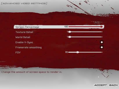
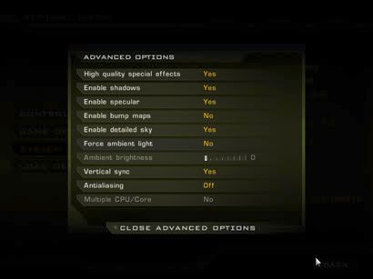
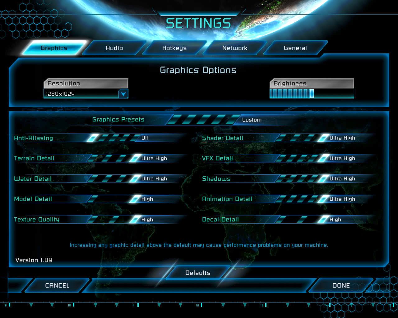
M?)Well one area I'll say Im dissapointed in UT3's GUI is the advanced video options, for a PC game well I'll let you guys be the judge. I included some other games pics here for comparison, I think its obvious from just one screen on some of these which ones arnt as good.
Unreal Tournament 3
Grand Theft Auto San Andreas

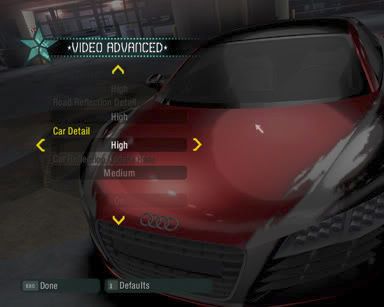
Need For Speed Carbon - This is the one I personally dislike most!
Command and Conquer 3
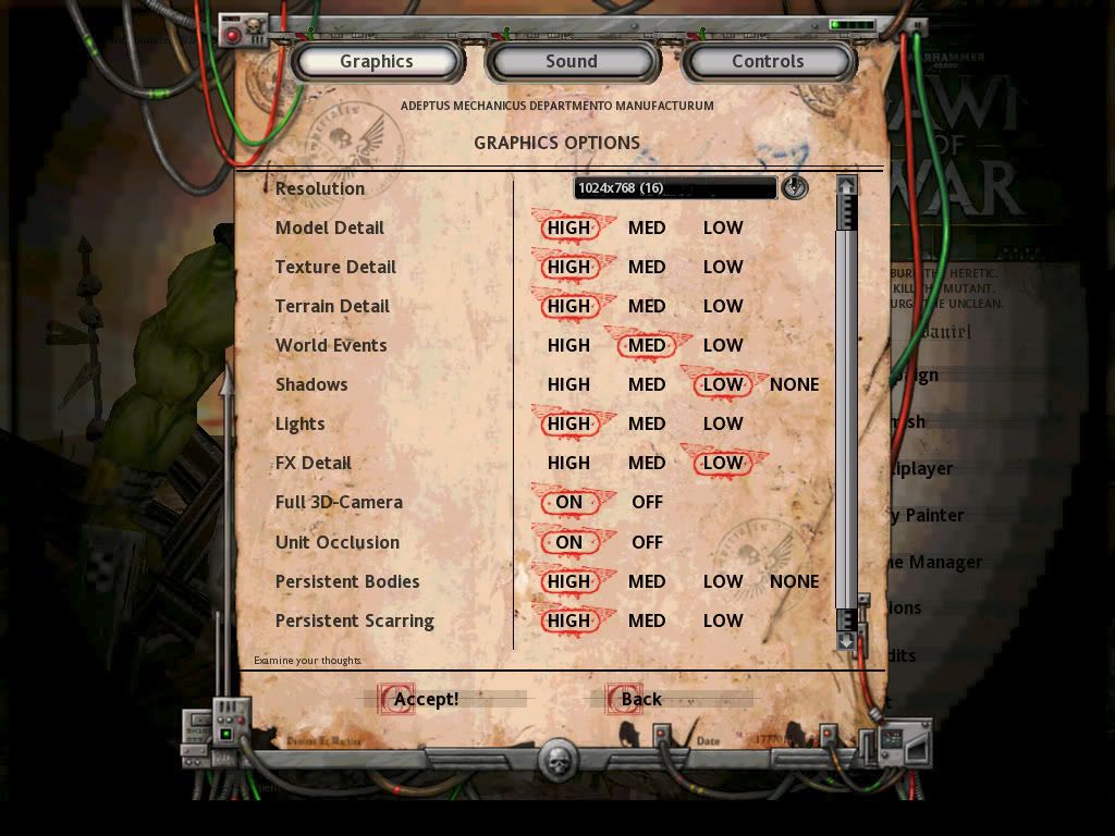
Warhammer 40k: Dawn of War
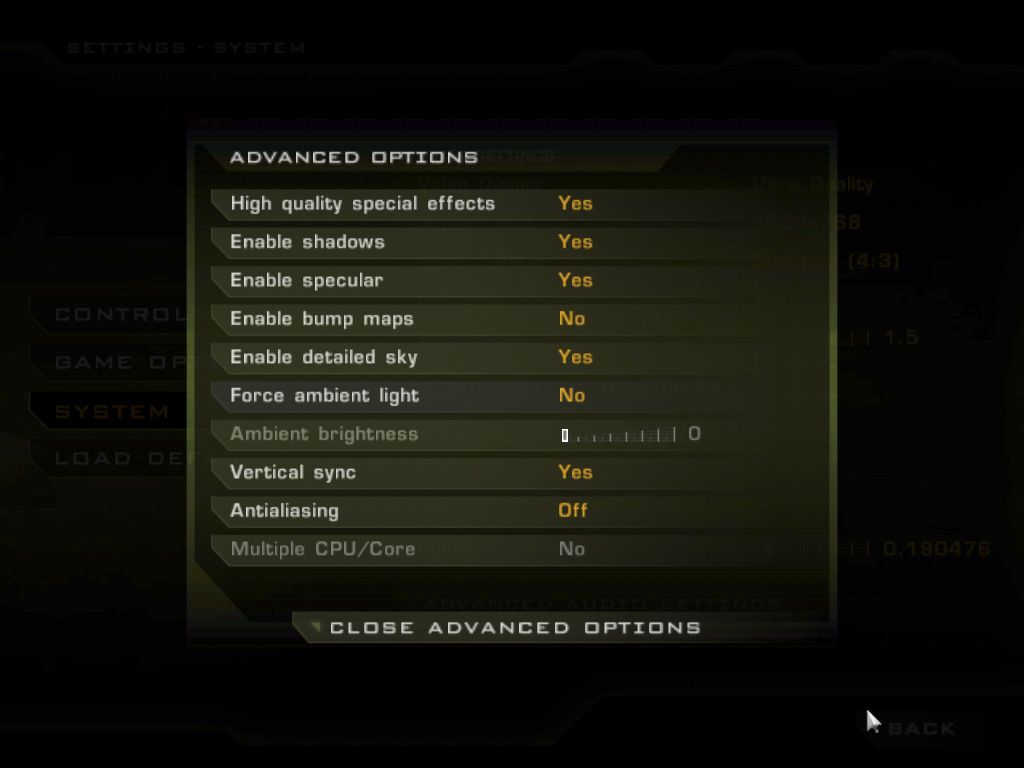
Quake 4
Enemy Territory: Quake Wars

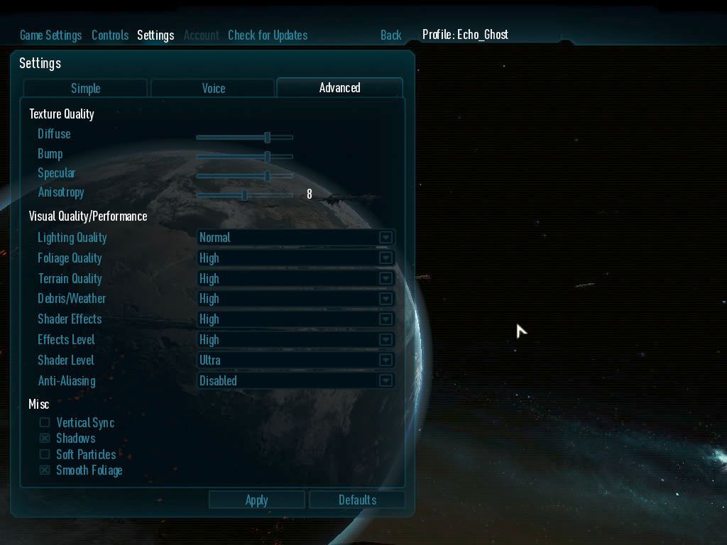
Supreme Commander
As you can see lots of different styled but even amongst the console port titles UT3's advanced graphic options are very thin. I think Quake wars is the best here, not in design but the number of options, it could make better use of screen space but the background certainly helps. If only they didnt cover the planet
GTA SA would have to be the worst visually but the options are still there and the menu is responsive. CNC3 is strange with the colours kinda blending but again the options are there. So visually UT3's might not be the worst for this single screen but option wise it is certainly the most barren even vs RTS games
Unreal Tournament 3
Grand Theft Auto San Andreas
Need For Speed Carbon - This is the one I personally dislike most!

Command and Conquer 3
Warhammer 40k: Dawn of War
Quake 4
Enemy Territory: Quake Wars
Supreme Commander

As you can see lots of different styled but even amongst the console port titles UT3's advanced graphic options are very thin. I think Quake wars is the best here, not in design but the number of options, it could make better use of screen space but the background certainly helps. If only they didnt cover the planet
GTA SA would have to be the worst visually but the options are still there and the menu is responsive. CNC3 is strange with the colours kinda blending but again the options are there. So visually UT3's might not be the worst for this single screen but option wise it is certainly the most barren even vs RTS games
Last edited:
Epic game's UI also consist of a map in the background that makes the whole menu a pain in the ass overall. It's far from what I expected coming from them. I still remember all the people who complained in the Beta, sooo many players refused to buy the game because of the ugliness and the way it's build especially for consoles.
MonsOlympus's post is showing a lot of standard options other games have, heck, even some of these games were console games, and they have way more options than UT3 has.
Crysis has a kick ass UI. So is C&C 3.
Here are obvious examples of customization.
[SCREENSHOT]http://aycu12.webshots.com/image/46851/2004218875568545205_rs.jpg[/SCREENSHOT]
[SCREENSHOT]http://aycu36.webshots.com/image/45915/2004214639583524675_rs.jpg[/SCREENSHOT]
[SCREENSHOT]http://aycu02.webshots.com/image/43561/2004275364063730642_rs.jpg[/SCREENSHOT]
There was a huge amount of people who said the UT2004 UI looked terrible, however, it's options were solid. Now I see how I appreciate UT2004's UI, and I don't think I'm the only one.
Last edited:
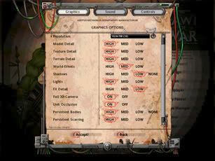
all UI designs look very similar, some actually have terrible methods to set values. For example, a on/off option is best displayed as a checkbox, and often multiple options are best shown using radio items. And you shouldn't hide an overview of the available values. Of that list San Andreas is clearly the worst one, except for draw distance is doesn't give much feedback on the possible values.
the warhammer 40k has made a mistake by placing the highest values first, it's English, so it should read from left to right. Min to max.
Quake wars did a good thing by grouping the types of options. But made the mistake by not making the visual quality sliders too. It's not consistent.
Supcom is consistent, every option is like any other option. yes/no shouldn'be be a dropdown item.
C&C3 has the best of the list (it has both visual and textual feedback of the current values), although the graphic preset thing confuses me.
If I would rank the design of the settings form (ignoring the number of options you can make) I would list is as follows (best to worst):
But this is just a settings part of the UI, it's something you would only visit in one game sessions.
the warhammer 40k has made a mistake by placing the highest values first, it's English, so it should read from left to right. Min to max.
Quake wars did a good thing by grouping the types of options. But made the mistake by not making the visual quality sliders too. It's not consistent.
Supcom is consistent, every option is like any other option. yes/no shouldn'be be a dropdown item.
C&C3 has the best of the list (it has both visual and textual feedback of the current values), although the graphic preset thing confuses me.
If I would rank the design of the settings form (ignoring the number of options you can make) I would list is as follows (best to worst):
- C&C3
- UT3/Warhammer 40k/ QuakeWars
- Supcom
- NFS Carbon
- Quake 4/GTA
But this is just a settings part of the UI, it's something you would only visit in one game sessions.
Last edited:
Yeah that crysis one is pretty good, I think its better when they do a spread like that and CNC3 but I still think the QW one wins in terms of options on a single page. It does have alot of wasted space though as with the UT2004 one so I do think there is room for improvement.
Oh I should mention my UT3 settings arnt really that low, I got it all adjusted manually in the ini hehe
Im not sure if sliders or combos are the best way to go but judging from some of the better screens a mix of both is best. The thing with combos is the dropdown comes down and covers the options underneath where you dont get that problem with sliders, mind you thats only for the duration of the choice so its not a big issue.
I do like how the RTS games have the model detail setting, like the car detail option in carbon as well. UT2004 has the character detail but I think that adjusts both textures and the model where textures does the world and weapon textures. Giving too many options can certainly be a problem but I do know UT3's advanced video could be far better, especially for a multiplayer FPS
the best thing about the crysis screen is the option to change to a different "major" frontend functionality (I assume those menu items are not disabled).
but for the rest they also made the mistake to use dropdown items.
also, I see that UT3 is the only game that provides context sensitive help, or do the others show it as pop up hints?
but for the rest they also made the mistake to use dropdown items.
also, I see that UT3 is the only game that provides context sensitive help, or do the others show it as pop up hints?
Its not so much the look&feel and a lot more the lack of options. The look isn't bad. What is, is the amount of navigating through the menus and the few options you can actually change.
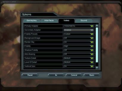
Example: UT3 vs CoD4
[SCREENSHOT]http://i10.photobucket.com/albums/a123/OlympusMons/GUIDiscuss/UT3_AdvancedVideo.jpg[/SCREENSHOT] [SCREENSHOT]http://screenshot.xfire.com/screenshot/large/49e009279d122d349ced0a8b2af8ad0d55dfc084.jpg[/SCREENSHOT]
Do I care if I need to change a setting by clicking on the value, and not use checkboxes, radio buttons or dropdown boxes? No, I can still change the values with ease.
Do I care if its not entirely clear what a setting means when I look at it? Yes, I guess that was a mistake in CoD4's interface. But at least I can change those settings in the interface if I wanted to, and that's certainly not the case with UT3. It doesn't go much further than world and texture detail, while the CoD4 settings screen equals UT3's world detail setting.
Of course, in the end its all a matter of preference and about what is important to you. I want an interface to be clean, easy to use and easily accessible.
For CoD4, I rate this: good, moderate-good and good.
For UT3, I rate this: moderate, bad-moderate and bad-moderate.
Hence, I prefer CoD4's.
Judging by post 11 you seem to hold most value for correctness of the user interface. If you find that important, then that's your call, but it doesn't for the vast majority of the community (insert reference to UI poll on utforums here).
It looks like this thread was made just to point out one good thing about the UT3 UI, and its something almost no-one really cares about.
You still haven't explained why the CoD4 interface is better than UT3's, and that was what I asked. You just said you liked CoD4's more.
It looks like you like CoD4 more because it has the basic graphic options combined with the advanced graphic options. And again it's the number of options that are made available to edit.
So UT3's whole interface is bad because of the lack of graphic options on the basic graphic settings page?
Where is the "cancel"/"discard changes" option in the CoD4 menu?
There are 3 main problems with the UT3 menu's, and they are self evident, i don't need to show you screenshots:
1) it takes too many clicks to navigate, 2k4's menu is an excellent example of how this can be avoided.
2) lack of options, the advanced video options menu is the most obvious example of the very few things we get to tweak in the menu's, but far from the only one, previous UT's all offered much more in their menu's, this one is unfinished.
3) the background map, loading 60 megs worth of map every time you visit the main menu, and only having it be visible as a blurry smudge in the background that might aswell have been an animated material of just a few meg's size, it's just a waste, what good does it do anyone?
Thease are the 3 main problems, and the lack of options is the big one here, its the one that really hurts the game.
There are other things i could point out, but then we would be moving into subjective territory, so let's not.
People are still complaining about the UT3 interface and how bad it is. Well, time to hand over the proof. Provide screenshots of user interfaces of "recent" (say... any game released in the last 5 years) games and explain why it is better than the UT3 UI.
UT2004, 3 years old..... WAY BETTER UI. Nuff said....Epic title, NO EXCUSE. It's a console menu, and not well suited toward the high demand of a PC player.
I can name plenty more games that have great UI's, and even many more that are'nt crap like UT3. Let me say it does'nt bother me that much, but it's clearly an issue I can totally identify with, and understand completely. It would serve most of my needs in an unpatched state, but still...it's gotta be the wrost UI I have ever seen, and that's something you normally don't even think about at all...at least I don't.
I think it's more of a warped "accomplishment" to severly screw up a UI, than to make a good one, cause good ones are so very common IMO, it's kinda something you expect w/o even expecting it.
No excuse, no camparison, and Muretue I have alot of respect for you, but : fail.
Last edited:
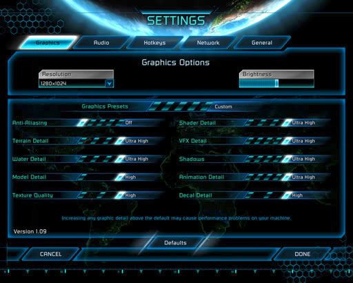
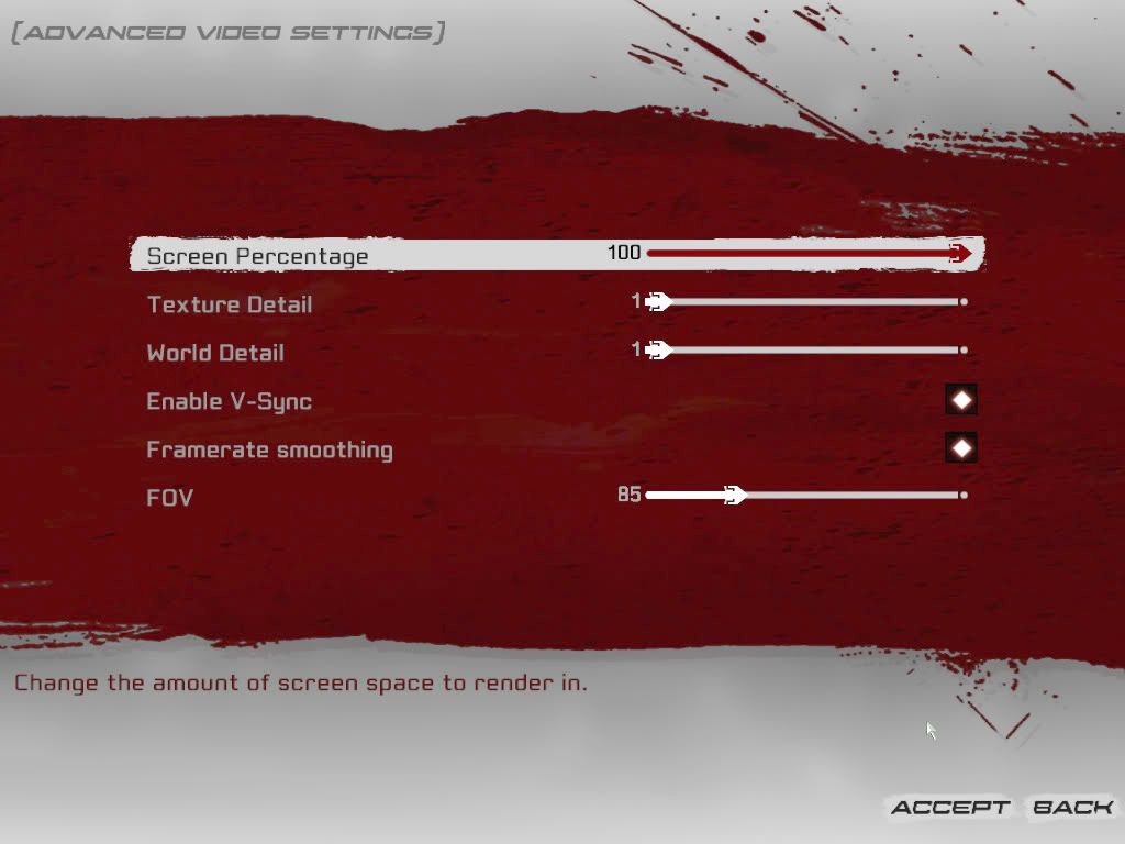
Comparing UT3 UI to the best UI that's been out the last 5 years, UT2004:
[Screenshot]http://i10.photobucket.com/albums/a123/OlympusMons/GUIDiscuss/UT3_AdvancedVideo.jpg[/Screenshot]
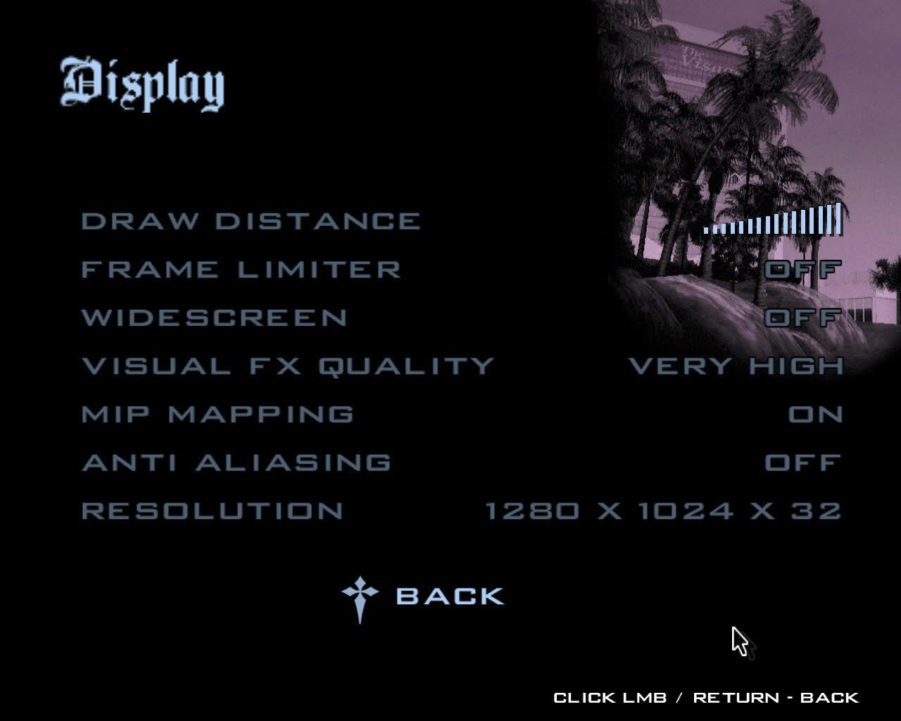
[SCREENSHOT]http://aycu02.webshots.com/image/43561/2004275364063730642_rs.jpg[/SCREENSHOT]
First of all, the UT2004 UI might not be pretty, but UT3's is plain ugly. The settings are just piled center with no attempts at giving it some focus like a frame or background. This is the least of my concerns thou.
The number of settings is oc a bigger issue, in 2k4 I had control over how my game looked and behaved, just as in UT3 there is context sensitive help (pop-up) and the settings make sense. The layout might be a bit piled, but I can't remember that it took me more then a couple of minutes to figure out where to go first time I opened up 2k4. Having 2 magic sliders that replaces almost all display settings forcing people into the ini's was a bad idea and I hope it's the last time we see them.
Handling. First of all I think it's really dumb to load a 60Mb map in the background (or is it loaded all the time?) every time I quit to menu. The UI feels slow and clunky, not sure the frontend.ut3 is the reason but I guess so. My quad is working harder in the menus then ingame and that's kind of sick. Having all these Back and Accept buttons makes it tedious to navigate around the UI, especially since everything is hidden in sub menus. In 2k4 I could quickly hit escape and change settings ingame without losing much time, in UT3 it's way more time consuming. At endgame the UI goes from being annoying to plain buggy and unintuitive. I get stucked in the UI, hit esc and it sounds like it changes something but nothing happens on the screen, there's a back button that doesn't work etc. The only bonus here is that we can chat during map change. Instant action is pretty well laid out and would work ok if settings were saved properly.
Also want to add that things like capping the FOV, removing SSD, weapon throw etc just adds to the crippled feeling. The FOV cap is the most retarded imo, had bought a nice wide screen to enjoy the UT3 gfx, but to play I had to plug in a 10€ 5:4 CRT. Epicplzfix. Maybe not directly UI specific, but it's sure settings that needs to be added there. =)
[Screenshot]http://i10.photobucket.com/albums/a123/OlympusMons/GUIDiscuss/UT3_AdvancedVideo.jpg[/Screenshot]
[SCREENSHOT]http://aycu02.webshots.com/image/43561/2004275364063730642_rs.jpg[/SCREENSHOT]
First of all, the UT2004 UI might not be pretty, but UT3's is plain ugly. The settings are just piled center with no attempts at giving it some focus like a frame or background. This is the least of my concerns thou.
The number of settings is oc a bigger issue, in 2k4 I had control over how my game looked and behaved, just as in UT3 there is context sensitive help (pop-up) and the settings make sense. The layout might be a bit piled, but I can't remember that it took me more then a couple of minutes to figure out where to go first time I opened up 2k4. Having 2 magic sliders that replaces almost all display settings forcing people into the ini's was a bad idea and I hope it's the last time we see them.
Handling. First of all I think it's really dumb to load a 60Mb map in the background (or is it loaded all the time?) every time I quit to menu. The UI feels slow and clunky, not sure the frontend.ut3 is the reason but I guess so. My quad is working harder in the menus then ingame and that's kind of sick. Having all these Back and Accept buttons makes it tedious to navigate around the UI, especially since everything is hidden in sub menus. In 2k4 I could quickly hit escape and change settings ingame without losing much time, in UT3 it's way more time consuming. At endgame the UI goes from being annoying to plain buggy and unintuitive. I get stucked in the UI, hit esc and it sounds like it changes something but nothing happens on the screen, there's a back button that doesn't work etc. The only bonus here is that we can chat during map change. Instant action is pretty well laid out and would work ok if settings were saved properly.
Also want to add that things like capping the FOV, removing SSD, weapon throw etc just adds to the crippled feeling. The FOV cap is the most retarded imo, had bought a nice wide screen to enjoy the UT3 gfx, but to play I had to plug in a 10€ 5:4 CRT. Epicplzfix. Maybe not directly UI specific, but it's sure settings that needs to be added there. =)
Last edited:
You still haven't explained why the CoD4 interface is better than UT3's, and that was what I asked. You just said you liked CoD4's more.
Yes, because its all a matter of opinion. I know you can discard a lot of things as opinion then, but the point here is that my opinion is shared by a vast majority (opinion not being CoD4's UI being better, but UT3's far worse).
It looks like you like CoD4 more because it has the basic graphic options combined with the advanced graphic options. And again it's the number of options that are made available to edit.
So UT3's whole interface is bad because of the lack of graphic options on the basic graphic settings page?
Actually, the "basic graphic settings page" is the advanced graphic settings page. And yes, the settings on that settings page is ridiculously low. Important settings like Bloom (Glow in CoD4) and Depth of Field should be adjustable from within the game, and not require quitting the game, edit the ini and launching the game again. Yes, I know, the World Detail setting adjusts that, but don't tell me you seriously think its a good way to change these settings this way.
Where is the "cancel"/"discard changes" option in the CoD4 menu?
There isn't any. Though I rather find it annoying that I have to press Accept In UT3 to have the options changed. After all, there's very little to actually change per page, and the likelyness of screwing up is minimal.
There are 3 main problems with the UT3 menu's, and they are self evident, i don't need to show you screenshots:
1) it takes too many clicks to navigate, 2k4's menu is an excellent example of how this can be avoided.
2) lack of options, the advanced video options menu is the most obvious example of the very few things we get to tweak in the menu's, but far from the only one, previous UT's all offered much more in their menu's, this one is unfinished.
3) the background map, loading 60 megs worth of map every time you visit the main menu, and only having it be visible as a blurry smudge in the background that might aswell have been an animated material of just a few meg's size, it's just a waste, what good does it do anyone?
Thease are the 3 main problems, and the lack of options is the big one here, its the one that really hurts the game.
There are other things i could point out, but then we would be moving into subjective territory, so let's not.
I must say that i agree almost entirely with Grobut here with the difference that i think the navigation must be sorted first and THEN fill it with content.
1. I basically stated the same thing in my first post. Main menu ONE click away minimum!
Its almost like those that made the menu used the opposite work procedure to the one used making the maps, Gameplay first THEN eyecandy.
2. Agree.
3. I agree. The sad thing is that im one of those that REALLY wanted the Unreal menu back
I have no idea why it worked in Unreal but not in UT3?
The way its blurred and all it doesnt give the ooh aaah feeling the Unreal menu did anyway.
I just wanted to expand to my first post about the menu navigating and the cursor. I think ive figured out why it feels...ambiguous i think is the word im looking for.
If youre looking at the pic below you can see that the cursor indeed has selected "Leaderboard" as it should but the problem is that the white background is giving missleading information to the eye.
The result is a ambiguous (that fancy word i had to look up again
)menu.
Last edited: