Gettin' better
")
Will post real feedback as soon as I get home, now Iwill be judging from screens
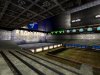
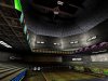
Firstly, texture choice - it is way too random here, those ads posters look really random and thus out of place. The thing you want to avoid is texture titling ie seeing the same texture many times on the same surface. Also make sure that you align surfaces otherwise level will loose its credibility, the thing you don't want to do.
Secondly, texture choise is inconsistent, they don't work well with each other as they have multiple colors. Brown + White - ish - bleh ^^ Lighting could be much better , make sure that you don't use white lights since it gives unfinished looks to the level ( well, except few exceptional cases
) There's supposed to be 3 light colors, which provide some contrast in your level, you probably don't want your level to look totally white / red / whatever.
Feedback about layout's coming soon
Anyways, you are improving
Keep up the good job.