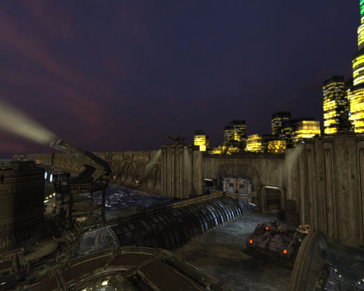
I disagree Slain, I think the lighting scheme he used is quite effective. That sun is almost gone. I don't think there would be any direct rays of sunlight to the ground or even a little above it at that point in the day.
maybe, but then, your view is a bit realistic and i think lighting is more about creating a feeling rather than being completely realistic. and a stereotypical sunset should have orange lighting. not too orange/red, of course and here i might actually go for something like one half orange and fading into a ver light blueish nighttime lighting.
Last edited:
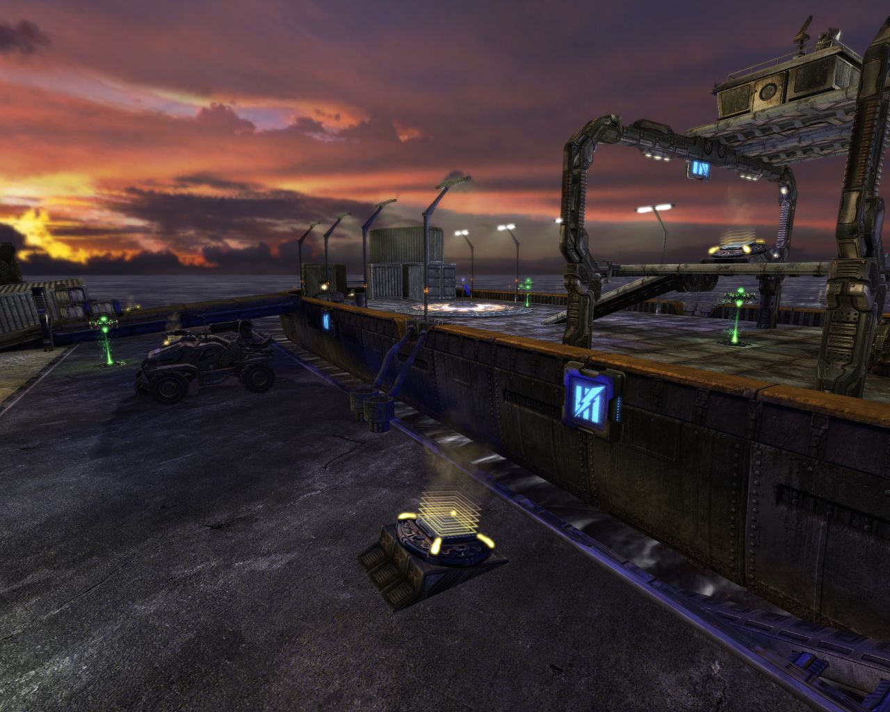
") The light coming from the sun is indeed orange, and casts really long shadows. I'm waiting for some performance-related feedback still, I'll officially announce the next version on BU as well
The light coming from the sun is indeed orange, and casts really long shadows. I'm waiting for some performance-related feedback still, I'll officially announce the next version on BU as well