UE2 - UT2kX Arachi - {2} .::)UT2004(::.

  • Two Factor Authentication is now available on BeyondUnreal Forums. To configure it, visit your Profile and look for the "Two Step Verification" option on the left side. We can send codes via email (may be slower) or you can set up any TOTP Authenticator app on your phone (Authy, Google Authenticator, etc) to deliver codes. It is highly recommended that you configure this to keep your account safe.

ArtCrazy

New Member
Apr 27, 2010
6
0
0
This ended up being the best map I ever did, so I went back and polished everything up as best I could. To me it's perfect now. I sort of felt like spreading the word and showing it off.
Feedback would be appreciated.


You may download the file Here to play through it -> http://www.gamefront.com/files/24141722/DM_Arachi2_zip

(+) 10-18 players recommended for the most ideal flowing gameplay.

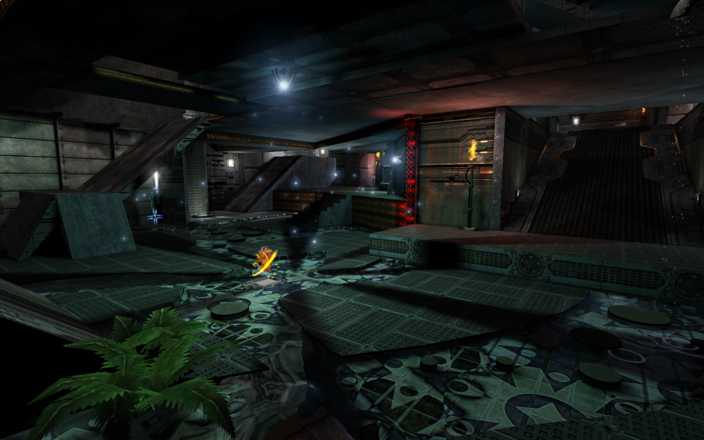
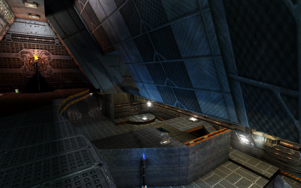
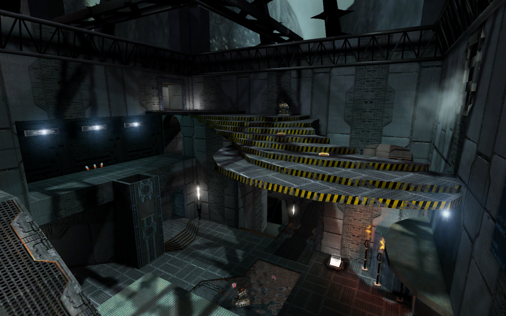
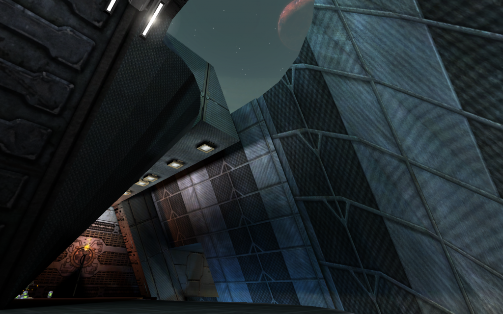
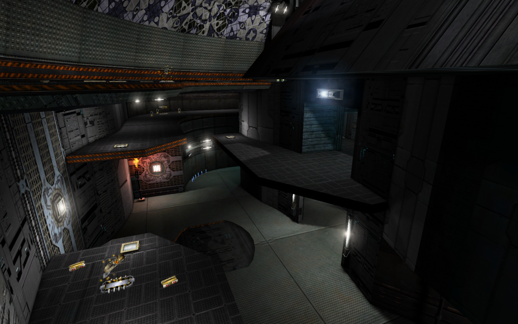
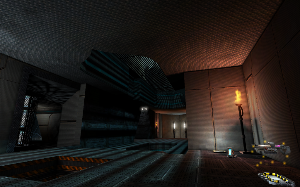
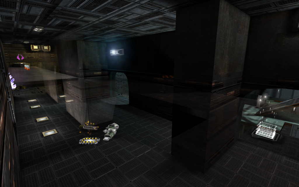
ARACHI II SCREENSHOTS


(+) Thank You for viewing.
 

madspacemarine02

random access user
May 2, 2014
41
0
6
Dude, you seriously need to rethink your choice of colors.

The problem is that he needs to consider that most people play with high gamma and
high brightness. Visually it looks OK. As long as there are the dark black shadows. But
unless you make the whole map one static mesh with shadows baked in the textures,
there is really no way to make something like that look good with high brightness and
high gamma.

---------------------------------------------------------------------------------

You might consider choosing another scale for future maps. This includes changing the
texture scale to at least 0.5 or 0.25 and make smaller BSP. The Pickups in UT2004 are
almost as high as the characters.
If someone imagines now a character standing by the Big Shield which is almost
as high as a player character model, it looks a bit strange. The Unreal titles have a bit
of a scale problem since the first Unreal, because of the state of tech back then.

Personally I think texture scale should be at least 0.125, but that's just me.

---------------------------------------------------------------------------------

I think it looks good. It's not close to the top custom maps for UT2004, but it's a good
effort.
 
Apr 11, 2006
738
0
16
Wormbo was referring to the light blue text on light blue background, I'm pretty sure.

I've played this map before and while it's decent for gameplay, the architecture is not well thought out in several areas. I can't tell what you did to the map from the version I played, but I notice you still have transparent BSP glass brushes with no support structure and all kinds of other weird architectural elements. It's not a terrible map but it's far from 'perfect' in any way. What you need to work on is having a consistent visual design, both for gameplay and aesthetics.
 

Jefe

The Dark Rat
Nov 11, 2008
157
6
18
T E X A S
www.vgmp3.org
Needs a new download link, the old one doesn't work.

From the screenshots, it looks like it could be a fun playing map, and the lighting looks good, but it doesn't seem to have a consistent theme. It's kind of a crazy quilt of texture and mesh styles. A bit lean on meshes, which is fine, but the textures just seem overly busy, and some of the brushwork seems really random, like the oval-shaped BSP inset into a square-tiling texture. You want to play to the strengths of your textures, especially if they aren't covered in static meshes. ;) Make your brushwork follow the design of the texture, or use a neutral base without strong lines or patterns. You also want to avoid using unnecessarily complex BSP brushes - I'd be surprised if you didn't have all kinds of run-ins with the BSP demons while making those curving catwalks and floors. :catfight:

Lastly, putting a huge sign with your name "Massacre" is just tacky. :(
 
Last edited:

leilei

ANIME ELF'S !!
Jan 20, 2008
575
8
18
I wasn't aware this was deviantart. Critique, harsh or not, is good, and holds more value than "wow good work excellent here have a llama". I strive for this kind of thing and I hardly get more than a 'good job' these days :(
 
Last edited:

madspacemarine02

random access user
May 2, 2014
41
0
6
I guess I'm different. I'm not very tough when it comes to
critique.

Since I am always doing something very different, if I create
something, I just don't take it very well. Even if I reply very
positive. Sometimes even core concepts of something get criticized.

I have no words for this. Sometimes a "OK, that's interesting",
is just all I need. I don't think that is very much to ask.

Something positive and nitpicks in moderation. Creation is my
"escape", I don't need too much critical feedback.

I always try to be positive to others, if I can.
 
Last edited:

Jefe

The Dark Rat
Nov 11, 2008
157
6
18
T E X A S
www.vgmp3.org
I guess I'm different. I'm not very tough when it comes to
critique.

Since I am always doing something very different, if I create
something, I just don't take it very well. Even if I reply very
positive. Sometimes even core concepts of something get criticized.

I have no words for this. Sometimes a "OK, that's interesting",
is just all I need. I don't think that is very much to ask.

Something positive and nitpicks in moderation. Creation is my
"escape", I don't need too much critical feedback.

I always try to be positive to others, if I can.

Wail and I both listed positives and gave constructive criticism - suggestions for improvement. This kind of feedback is very helpful to mappers. A simple pat on the back doesn't do anything but inflate one's ego. A vague response like "OK, that's interesting..." is even worse - it implies there was something wrong, but you don't want to explain. Constructive criticism can help improve one's work by suggesting better techniques, layout, etc. It is what is expected in creative forums like this and shouldn't be taken as a personal affront.

But I'll admit the "tacky" line I made was not constructive, so I'll explain myself. It's annoying to see a big huge personal or clan logo in a level meant for release to the public. There are ways to give a map a personal touch without making it the largest, most distinctive visual element in the level. It's even worse if it's the only noticeable custom content in a map - like if a movie director spent all of his budget on making a cool logo, but didn't have any money left to make other props. A subtle reference or an easter egg that goes with the visual design of the map is much more preferable - like a faded billboard in an urban level, or fake company name on a supply crate or monitor. The key is to make it look like it belongs in the environment.
 

Wormbo

Administrator
Staff member
Jun 4, 2001
5,913
36
48
Germany
www.koehler-homepage.de
I recently posted images and explanations of a project on another forum. I was quite disappointed about the "wow", "nice", etc. posts. While these told me people liked what they saw, there's no further information for me to take away from the thread.
If it's only about getting a "how much do people like this?" rating, we would replace the reply button with a "rate this thread" button and be done with it.

As far as this map is concerned:
Yes, quite nice. Maybe some additional trim here and there could make it look even better.
 
Last edited:

madspacemarine02

random access user
May 2, 2014
41
0
6
Sorry, but we all talk a different language here.

My "It's Interesting" means: Given the time and personal constraints you did an awesome job trying to achieve your goal.
This means that the reviewer saw that the mapper tried to do something different. Even if the reviewer can't understand it.

My "Good/Nice" means: You did everything possible to make a close to perfect result. Yes, this rating depends more on the
"skills" of the reviewer than the mapper. [ The way I see it: Skill = (Time+Money) ]

Not every concept needs to be executed perfectly. Perfection is boring.

A great piece of art has to have flaws.

Finally a creator needs to decide when something is finished. Otherwise the creation
can become a failure, because the thoughts and inspiration leading to it are gone.

----------------------------------------------------------------------------------------------------------------------

I wish this discussion could have been in private. This is nothing a mapper should see. It bloats the thread unnecessarily.