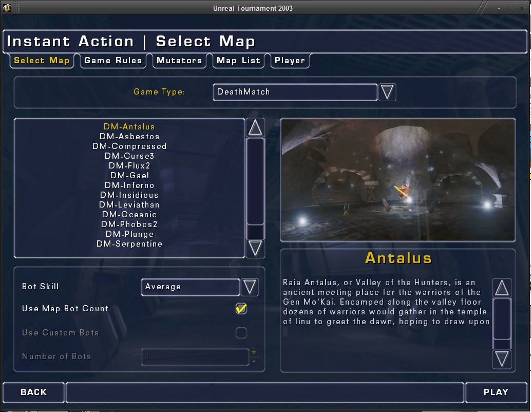
Well okay I got a few more pictures on the way but I thought I would start with 2k4 since I knew alot of people would bring this one up. Honestly 2k4's menus might have more options but its far from better than UT3's hands down.

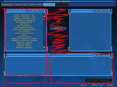
Take these two for eg, you can see that the lists could have been made bigger easily to prevent extra scrolling, something which is also prominent on this HL2 one.
[screenshot]http://img187.imageshack.us/img187/5655/hl2guihg7.jpg[/screenshot]
The thing which gets me about the HL2 one is that the server browser is adjustable. But these config keys arnt.

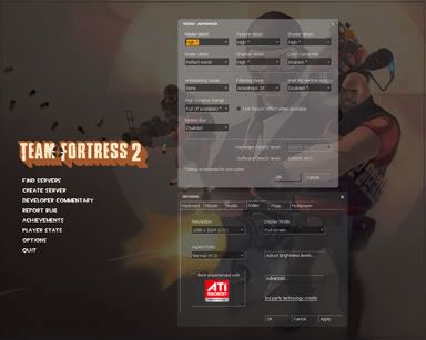
Could it have had something to do with the advanced vide options? Well if they were all put on a single page it would have saved scrolling in the config key menu.
Anyways back to 2k4...
[screenshot]http://i10.photobucket.com/albums/a123/OlympusMons/UC2004/GUI/ServerRules_newvsold.jpg[/screenshot]
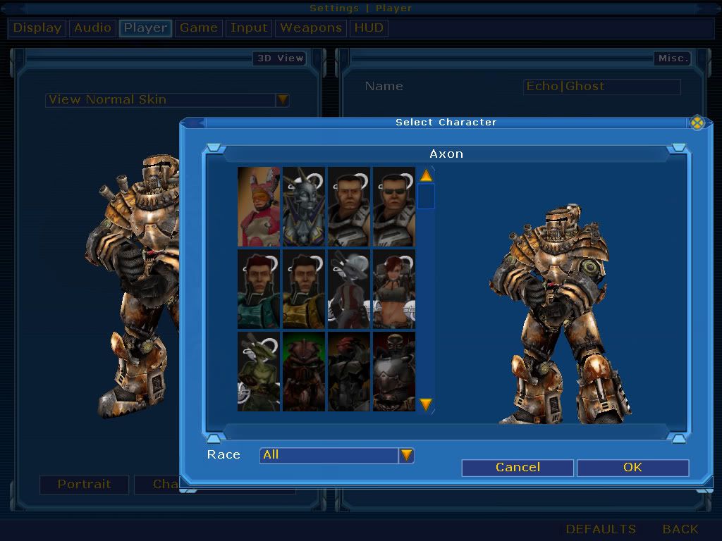
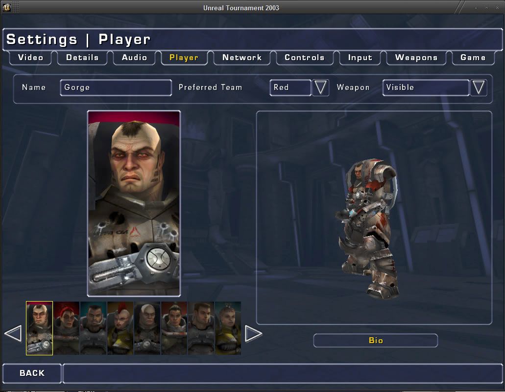
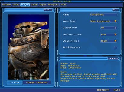
[screenshot]http://i10.photobucket.com/albums/a123/OlympusMons/UC2004/GUI/NewCharacterSelectHead.jpg[/screenshot][screenshot]http://i10.photobucket.com/albums/a123/OlympusMons/UC2004/GUI/NewCharacterSelect.jpg[/screenshot]
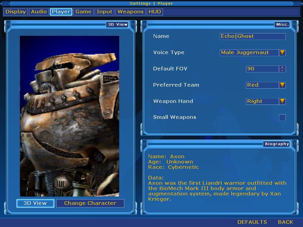
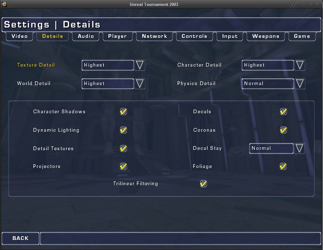
As you can see these are some adjustments I made on the GUI to make it cleaner, one of the things I never liked about 2k4 was this popup page mania it has going on. Having pages full of options is all well and good but you gotta make the best use of the screen space avaliable in my eyes, something which some GUI's do better than others.
With the midgame menu its not obvious you can scroll in server info part since there are no visible bars, but you can. Although a small tweak and you have a much better view of a longer maplist and all the server info on there right in your face.

You want each page to have a clear and concise description for the options it contains which is another area 2k4 fails. Some things are dumped under sound, hud and whatnot and could have been put together on other pages provided the extra room was made.
So I think the biggest problem with UT3's menu is this big strip in the middle and that options fall on that. It doesnt stop there though as a side by side layout like cnc3 or crysis could have provided better use of screen space for those options.
[screenshot]http://i10.photobucket.com/albums/a123/OlympusMons/GUIDiscuss/mutcustomutv045-01.jpg[/screenshot][screenshot]http://i10.photobucket.com/albums/a123/OlympusMons/GUIDiscuss/mutcustomutv045-02.jpg[/screenshot]
As you can see though it is hard to see the tabs with the text being that close together but the options being in 2 columns makes better use of the screen space. The weapon names down the side make it quicker to get to the subpages for each weapon also, keeping all the weapons cleanly on 1 tab button.
[screenshot]http://i10.photobucket.com/albums/a123/OlympusMons/GUIDiscuss/ut3wa-04.jpg[/screenshot]
This is an early version webadmin interface, as you can see the mutator selection makes fuller use of the screen space and the bar down the side allows for all expanded menus for less clicking. It also has radio buttons for multiple selections instead of dropdown lists or just lists.
We all know 2k4 has more options and I dont think thats the point of this thread, this thread is to discuss the interface itself!

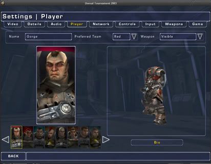
See now this one has a nice amount of options, the tabs are pretty spot on with their description of what they contain and theres a 2 column type layout. The character selection menu is cleaner without the popups and has a novel way of scrolling through the characters so it takes less screen space but still keeps all the options avaliable to the player.

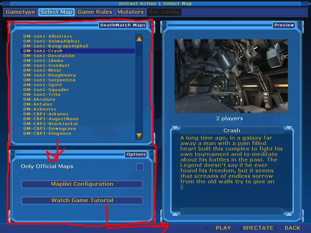
This one I though was a good idea because the gametype is a dropdown selection so instead of having a page dedicated to gametypes alone it allows you to select much quicker. Now ofcoarse this makes it harder to add gametypes to the list as the dropdown box could get really large with custom content and whatnot, it also doesnt allow for context help.
Elmuerte has alot of good points in comparison to other GUI designs though, so I think we should perhaps keep this thread as objective as we can. I sure have my personal opinions but I can put that aside to some extent to view each GUI and design for what its worth.
Acouple of problems I have noted down on the UT3 GUI is the lack of sound when directly clickin an item vs the horrible donk donk when scrolling. So it feels like it was made to be used with a keyboard or analog stick or something more than over a mouse. It is a good menu and certainly has potential but I think the lack of options is what gets most people annoyed over it. It doesnt really have a huge amount of extra clicks over the 2k4 menu and if you want to talk clicks 2k3's menu is much better in that respect.
I think having a bar with smaller text and expanding subpages like the webadmin might be a good idea, also using 2 columns as much as possible and trying to unify things to sliders or combos where possible instead of a mixture of the two. One thing I would suggest is perhaps a slider like the cnc3 one which allows the value to be shown in an edit box rather than a numerical value.
Welp thats about all I got so far, I'll install acouple of other games which I'll take screenies of for comparison