
ive only been back into editing for the last month (still editing for UT cuz in my opinion its better gameplay and the editing doesnt come as easily as with 2K3)....... and ive gone through a few ideas and ended up doing the one i left off with...... ") trying to improve it of course..... tell me what you think...... plz be gentle
trying to improve it of course..... tell me what you think...... plz be gentle
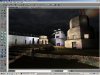
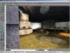
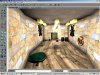
DM-Unchained
Author: SilvaOne (ME!!!)
EDIT:its still a beta so i havnt got all the buildings right and all the textures etc.......
trying to improve it of course..... tell me what you think...... plz be gentle DM-Unchained
Author: SilvaOne (ME!!!
)EDIT:its still a beta so i havnt got all the buildings right and all the textures etc.......
Attachments

Last edited: