
UT3 VCTF-DestroyedCapitalBeta[PC][PS3]
- Thread starter Hitman0769
- Start date
-
Two Factor Authentication is now available on BeyondUnreal Forums. To configure it, visit your Profile and look for the "Two Step Verification" option on the left side. We can send codes via email (may be slower) or you can set up any TOTP Authenticator app on your phone (Authy, Google Authenticator, etc) to deliver codes. It is highly recommended that you configure this to keep your account safe.
You are using an out of date browser. It may not display this or other websites correctly.
You should upgrade or use an alternative browser.
You should upgrade or use an alternative browser.
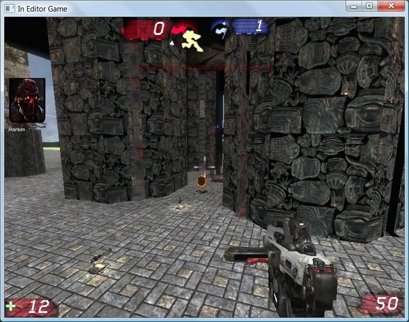
This is REALLY not something you need to show people, let alone release. Come back in a few months when it doesn't look like such an abomination. Seriously, who is going to download this just to see what the gameplay is like? There's a point where no matter what the gameplay is like, visuals that bad are just going to ruin it every time.
I do believe this sick map has great gameplay, now it's time to send it to some familiar graphic designer ")
Firefly
United Kingdom is not a country.
Lol. The amount of intelligent responses on this forum is dissapointing, I guess you guys have no imagination. Your loss not mine. @ HedgeMASTER --- glad you enjoyed it, I have been very stressed out and busy lately so the next version won't be here for a while guys. And its not your choice if i release something or not but once again thanks for all the advice from evreyone even though none of it is relating to the map itself. Very helpful lol.....
Intelligent responses, hmm...
Ok, I'll try giving one:
Look at your map. Look at it closely. Look at how you arranged stuff etc.
Now open a UT3 VCTF map by Epic Games. Notice how they arranged stuff.
Back to your map. Look at it again. Can you see those subtle differences between it and the Epic VCTF map you just looked at? I'm pretty sure the lot you accused of giving unintelligent responses did.
If this map was a gameplay test, it actually could have stood to look a lot worse than it does. This hybrid between crappy looking design and the nicer textures hasn't done the map any favors. Right now it ends up looking like a progenitor of Thorns or that UT2004 map with the toilet cars based on a Counterstrike level.
If i was asking for graphics advice this thread would be very helpful, however i never did ask for such advice. Thanks for nothing all but 1 poster.
Oh, and another hint: Find the map file in Explorer and select it, then find the Delete key on your keyboard and press it. That's really the best improvement that map could get.
No offense, but first-ever maps do not belong into publicly accessible areas, unless you like to provoke reactions like those you got.
No offense, but first-ever maps do not belong into publicly accessible areas, unless you like to provoke reactions like those you got.
Try ignoring the grafix if you are mentally sound enough. And checking out what I did gameplay wise. Or is that too much to ask of the all mighty forum posters?
Sorry, but UT3 doesn't have a touch interface and I don't want to risk blowing my aesthetics sensors by looking at an interactive version of that... that thing.
Sorry, but UT3 doesn't have a touch interface and I don't want to risk blowing my aesthetics sensors by looking at an interactive version of that... that thing.
Wow you really are a nerd wormbo.
"No offense" as u said, i consider myself a bit of a nerd sometimes but wow... you take the cake my man. "aesthetics sensor"? nice one.. laughed so hard i almost cared what you have to say. and you can go ahead and assume i wont be posting any more maps until they are at a way further stage. Obviously this community is so dead we can barely get Epic to make servers nevermind expect actual usable feedback on prototype maps. My mistake for assuming anything different.
Peace
Woah woah, settle down. Take a deep breath and relax. Don't start blaming the community because you came here and released an extremely early alpha of a map and didn't make it clear you only want feedback on the gameplay and that visual details are forthcoming.Wow you really are a nerd wormbo.
"No offense" as u said, i consider myself a bit of a nerd sometimes but wow... you take the cake my man. "aesthetics sensor"? nice one.. laughed so hard i almost cared what you have to say. and you can go ahead and assume i wont be posting any more maps until they are at a way further stage. Obviously this community is so dead we can barely get Epic to make servers nevermind expect actual usable feedback on prototype maps. My mistake for assuming anything different.
Peace
Maybe the comments you are getting aren't what you wanted to hear, but that's life. Sometimes you make something that maybe you are proud of, but no one else thinks is any good. That happens. You have to take it with dignity, though. Don't start arguing with people, and don't start name-calling. If you want constructive feedback, you need to do a better job of asking for it, and lashing out when people give you comments that aren't just empty praise is definitely not the way to get feedback on your maps, let alone improve them. All you're doing is showing the community that you aren't going to listen to anything they have to say unless it's what you want to hear.
What you should be doing, instead, is acknowledging the poor visuals and that while the map may not be pretty to look at, it is still fun, because it is to you, right? When people express disapproval, don't get mad; ask for advice on what you could do to make the prototype less garish. Don't throw a tantrum.
My advice to you now is to work on the map some more and improve the visuals quite a bit. Even for a prototype, this map is just plain hideous, and it doesn't look like you put serious effort into it, which is why people aren't going to play it. Even prototypes need to have some standard of quality if you want to attract players and get their feedback. Also, don't release so many screenshots when the map is obviously incomplete and nothing to look at; the screenshots don't really show off any of the gameplay. Instead, the poor visuals distract from any other thoughts someone could have. Instead of wondering how the Leviathan out in the distance might impact the game, people get fixed on the terrible stairs in the first screenshot, etc. There might be some inventive stuff in this map, but you need to be more open and honest that you are just working on a basic prototype and not a graphical masterpiece (at this point). Then, later, you can show progress as you add visual detail and get advice on how to improve.
I hope this advice actually is useful to you and you don't just take it as an insult, because I wouldn't have bothered to write any of this if I just wanted to just crap on the map. Same with my other comment: it may have been a little harsh, but it's true - people aren't going to want to invest time in a map that looks like this unless you give a good explanation of why it's worth their time or you make it look better before releasing an alpha.
Firefly
United Kingdom is not a country.
I gave my feed back ages ago.
But hitting out at people means your map won't be looked at. Who wants tp help anyone who has an attitute. I (like quite a few others here) have been doing this for years and the community is getting stronger since that dead, pre v2/titan spell.
I hope this light hearted joke illustrates what a lot of people are trying to say.
Code:
<script>
if (criticism> 1)
  {
  document.write("thanks");
  }
else
  {
  document.write("wait");
  }
if (thick skin=false)
  {
  document.write=("find a new hobby");
  }
if (thick skin=true)
  {
  document.write=("progress and strengthen mapping skills");
  }
</script>Lol. The amount of intelligent responses on this forum is dissapointing, I guess you guys have no imagination. Your loss not mine.
No imagination? Or loss?
Have you checked out the other threads on this board?
No offense, I'm not here to troll your butt, but I totally have to agree with Waffnuffly on this one. Kinda funny on how you say we have no imagination yet put a leviathan in the middle of some bsp blocks using mesh materials with 10 teleporters around it.
Very ironic of you.
Yes some response are harsh, but come on, you can do better.
How can Wormbo be a nerd when he is just pointing out the obvious, i mean to the majority of us, pointing out the obvious is something a 4 year old child can do; but i can see now, due to your lack of intelligence and skill, it may appear to be a 'nerdy' thing to be able to do.
Basically, not going to waste an entire paragraph of ranting about this hideous frenzy of BSP, the screenshots speak for themselves. Your attitude and the fact you think you have the right to post a map like this amongst those talented mappers who have worked their arses off, is franky insulting.
Its ugly. People appreciate what you call 'gameplay' because they have cleverly retained it whilst working around the impressive visuals of the map, to retain its realism. A few blocks is not gameplay; its boring.
Don't spam these respected forums with complete rubbish, deleting this post and the map would be the best thing you could do.
Putting your insults aside, buying Hourences' book 'The Hows and Whys of Level Design' should help you, furthermore visit begginer tutorials at www.angelmapper.com =]
Last edited:
Indeed, the default checkered texture gets the "concept stage" part across better than anything else.
The BU Elite sure know how to dish out heaping helpings of discouragement. Give the guy a break.