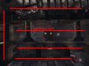
So, WishmasterNL, check the attached picture. I'm gonna mix general issues with details as they came to my eye during (I admit it) short walkthrough the level. ;-)
First thing first - you started with quite a big level really - I don't know for how many players you planned this but it's 8 and more if you ask me. And you carried it out into something that looks playable (I'm talking about measure of finish, not about quality now
)")
. That's all good - many ppl can't get things so far. Now the worse part. ;-)
The map is big and plane on most places. You have generally 3 floor tiers here and they are all flat. No height variation on one particular level. See some other levels (even retail) how they go up and down - and find some extent how much you want your floor go up and down. It adds sort of "micro-z-axis".
")
Overall z-axis is fine, because you have big height differences here. You can question the realism of floors going up and down - of course, but your map has some architectural and realism issues as well, so we skip this part.
Biggest issue (for me) are long lines of sight. Corridors are long and straight, there is not too much cover. Especially "long&straight" is the problem here. Also second level in the center is wide open and also boring and bare. Scaling of meshes and textures is quite fine, but overal shape of the level is overscaled if you ask me. Long ways to walk. Make it a bit smaller and that will fix few things:
* less work when you want to add proper details in the map, less boring result;
* better and intense gameplay, less sniping;
* some structures will get smaller and more real... look at the bridges marked with #5 on the picture... way too long without proper support.
Shortly to the rest from the pic:
#1 minor thing - you can hit the lamp over the jumppad and it will kick you down - it's unlikely, but it happened to me, so it's possible ;-)
#2 support beams made of bricks... every structure like this made of bricks is always arch - rounded. Bricks would never hold like this. Also near the number, your beams don't touch the wall properly and also end half in the brick wall and half in the window. Unreal and ugly.
#3 watch the ramp from the side. Trim texture goes to sharp end there, looks wierd, other ramp (left bottom of the picture) has better trimming.
#4 generally, the map lacks more trimming. Many textures meet one another on the sharp edge which looks bad and it isn't realistic.
#5... long structures without proper support as I said.
I hope I didn't demotivate you because it wasn't my goal + you can work things out as I see. Try to rething some features of this map and definitely keep on mapping.