Jailbreak custom actor icons needed

  • Two Factor Authentication is now available on BeyondUnreal Forums. To configure it, visit your Profile and look for the "Two Step Verification" option on the left side. We can send codes via email (may be slower) or you can set up any TOTP Authenticator app on your phone (Authy, Google Authenticator, etc) to deliver codes. It is highly recommended that you configure this to keep your account safe.

tarquin

design is flawed
Oct 11, 2000
3,945
0
36
UK
www.planetunreal.com
Does anyone feel like making UnrealEd actor icons for some of the following Jailbreak custom classes?

  • JBPanorama
  • JBProjectileSpawner


You can find out what these are on the JDN.

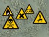
I've attached a pic of the custom icons we already have, to give you an idea of the style. These are for generic release, jail, timed trigger, camera and arena respectively.

EDIT: icons should be 32x32. No JPEGs please!

EDIT2: these are done, or don't need icons

  • JBGameObjectiveTouchable (already has one)
  • JBMaterialTrigger (doesn't need one)
  • JBTriggerTimed (we've got one now)
  • JBVolumeTunnelExit (displays a volume: doesn't need one)
  • JBExecutionBasic
  • JBExecutionBurning
  • JBExecutionDepressurize
  • JBExecutionLightning
  • JBExecutionSkeletize (see below for the execution icons!)
  • JBMonsterSpawner
 

Attachments

  • JB custom actor icons sample.JPG
    JB custom actor icons sample.JPG
    8.2 KB · Views: 51
Last edited:

Wormbo

Administrator
Staff member
Jun 4, 2001
5,913
36
48
Germany
www.koehler-homepage.de
Does the JBMaterialTrigger really need its own icon? There's the Engine.MaterialTrigger's icon already: S_MaterialTrigger.
The JBVolumeTunnelExit is a volume, its icon would never be used.
 
Last edited:

tarquin

design is flawed
Oct 11, 2000
3,945
0
36
UK
www.planetunreal.com
I like the yellow triangle!
Care to make that a theme for all the execution types?

PS. Don't make icons as JPEGs: you'll get blurry edges. GIF or PNG please.
 

Trueblood

Silly Brit
Jan 19, 2003
842
0
0
40
Brighton, UK
www.yourass.com
tarquin said:
I like the yellow triangle!
nice
anyway, fixed the elect to the right size (i hope) and your idea with just the lightning anybetter?
As for the skull, is it clear enough? the second one should have a silver outline which makes it brighter but at this size, loses the shape.
 

Attachments

  • electro.gif
    electro.gif
    1.4 KB · Views: 201
  • electro2.gif
    electro2.gif
    1.3 KB · Views: 201
  • skel.gif
    skel.gif
    1.4 KB · Views: 200
  • skel2.gif
    skel2.gif
    1.4 KB · Views: 199
Last edited:

tarquin

design is flawed
Oct 11, 2000
3,945
0
36
UK
www.planetunreal.com
ok, here's a potatoshop doc with a basic yellow triangle, your lightning icon, and two versions of a skull. (Tip: when in need of simple images, try wikipedia :)

I think a series of icons with the same basic shape is good -- so what I think we should do is add further graphics to the inside of the triangle for the other death methods.
 

Attachments

  • icons yellow triangle.PSD
    15.7 KB · Views: 30

tarquin

design is flawed
Oct 11, 2000
3,945
0
36
UK
www.planetunreal.com
Here's an updated version.
I've got burning, basic and skeletize done. I've got an "explode" one (from the chemical hazard labels, same place I got the flame image), in case we do an explode custom death (Hint! Hint!)
I've tried doing a diamond like the chemical labels, but on yellow it just looks like US road sign :( and in red I don't think it'll be clear enough in UEd.


All I need now is depressurize. Any ideas?
 

Attachments

  • icons yellow triangle (clean).PSD
    18.9 KB · Views: 24

TheSpoonDog

CBP3! Yarrr!
Jun 1, 2001
2,592
0
36
42
NZ
spoondog.beyondunreal.com
Here's the file with the explode icon, and two suggestions for depressurize.

EDIT: I actually just had a thought - if you don't like the two other icon ideas in that file for depressurize - why not a simple exclamation mark?
 

Attachments

  • x_icons yellow triangle (clean).PSD
    25.9 KB · Views: 22
Last edited:

tarquin

design is flawed
Oct 11, 2000
3,945
0
36
UK
www.planetunreal.com
Nice work, Spoon. I like the dial one better of the two depressurize icons.

The more I think about it (yes, I am turning into Mych!!! :eek: :lol: ), the more I find myself preferring a red diamond. The shape is nicer and it gives a tiny bit more room for the central part of the icon. I've tried lightening the red a bit, like this. Do you think the contrast is enough?
 

Attachments

  • ued icon diamond skeletize.PNG
    ued icon diamond skeletize.PNG
    898 bytes · Views: 167

Trueblood

Silly Brit
Jan 19, 2003
842
0
0
40
Brighton, UK
www.yourass.com
I think the yellow and black would go better, wouldnt the dark pinkish colour hide the black?
maybe we should look at aircraft safty signs or something about pressure...

[Edit] looks like i found some more triangles! proper ones (no dodgy resizing from me this time ;) )
 

Attachments

  • signs.zip
    11 KB · Views: 23
Last edited:

tarquin

design is flawed
Oct 11, 2000
3,945
0
36
UK
www.planetunreal.com
Trueblood said:
I think the yellow and black would go better, wouldnt the dark pinkish colour hide the black?

Yeah, that's what I was worried about. Let's stick with the yellow triangles then.

Trueblood said:
maybe we should look at aircraft safty signs or something about pressure...

Chemical signs have a sort of gas cylinder to indicate pressure. But I was worried Spoondog or Sexmachine would say it's a dildo... :rolleyes:

A windsock maybe...? Could suffer from the same problem...
 

ZedMaestro

Useless
May 18, 2003
1,206
0
0
37
Dorset, England
Visit site
If you're still stuck for a depressurized icon, how about trying the standard execution icon but with the "fish-eye" or "bulge" effect applied to it. I did try this out myself, but failed miserably. Just a thought.